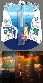
Early on in the exhibit development stage (that is, the stage when the design committee, consisting of educators, scientists, exhibit designers and others) we learned that the Argo Project people wanted to be a part of the climate exhibit. The projects basically consists of thousands of torpedo-shaped floats that take measurements of its surroundings, such as salinity and temperature, at all or any depth of the ocean. Previously thought to be resistant to climate change due to its vastness, we now know that the oceans too are warming dramatically, down to deep depths. This has huge implications for the ocean current system around the earth, which in turn affects the climate.
But rather than focus on the science data, which could be overwhelming, the original intention was to use the Argo Project as a showcase of new scientific technology that is being used to monitor climate change. So, the float itself was to be a center piece. Someone thought, wouldn't it be cool if the float was in a column of water, and if it rose and sank every so often.
I was asked to produce a concept drawing featuring the water column, an area that simulated an underwater environment, plus some interactive computer stations to the side, and a backdrop that included some radar-type communications relaying info collected by the Argo to some central station. The concept drawing would be used to present to potential doners at fund raising events, to show the Argo people what the exhibit might look like, and also for the design team to bounce ideas off of.
At this point, nothing is precise. A concept drawing is visualizing an idea. During discussions about what is going into the Argo Project area, pictures start forming in my head, and then when it comes time to drawing it, I usually have formulated a good idea of what the scene is going to look. I know what angle I'm going to show that will show off the elements, I know the image composition, I have an idea for a color scheme. I'm sorry I can't really verbalize how all that comes together; I've certainly not had any formal training in this. It may have come from drawing imaginary worlds as a kid. It's the same, except I have a set of parameters.
I draw in pencil, add some people who are looking happy to be at the exhibit, ink it, throw it in photoshop and drop in some color, and voila. The whole this is supposed to be relatively fast, since the sooner it's done, the sooner we can better tailor the exhibit element to our goals.
In the real version, the water column was scrapped. An engineering nightmare, apparently, not to mention a cleaning nightmare. The float is there, immobile and encase in a plastic box. The watery background stayed, though instead of depth the isotopes show, I think, water temperature of a sample transect. Notice the little radar scene is still there, and the computer monitors with maps became non-interactive wall panels. There is such thing as too many computer consoles in an exhibit - and they're expensive. To the far left, which I've cropped out of the photo, is a talking head. That is, a video of a scientist talking about his or her research. Too many talking heads are bad too, but we only have, oh, three main ones in the Feeling the Heat.