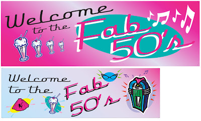
At the Birch Aquarium exhibits dept, we are busy churning out graphics for the upcoming Shark Week as well as the annual volunteer party, this year with a 50s theme. The large format printer is chugging away at 100" long posters, at this very moment, churning out the top "Welcome" poster. The original design is on the bottom, by another designer. As always, I was supposed to just print out the poster, not edit it, but I couldn't resist. I felt like it could use a shot of pizzaz... it needed to be tied together. Plus, I have strong feelings against clip art.
So... I changed the font size to emphasize "Welcome, de-emphasized "to the", and enlarged "Fab 50s", additionally further enlarging the "F". Put the whole thing at a slant, and made the text fill the whole poster, since the welcome message is the whole point of the poster. I got rid of most of the distracting clip art which drags the viewer's eye all over the place, but kept the sundae and music notes, and repeated and placed them so that they draw the eye towards "Fab 50s". Whittled down the color scheme to pink and white, re-used the oval motif, but this time to emphasize only "Fab 50s" and not 4 different clip art images. I thought the turquoise showed off the pink and white lettering nicely, and the tilt of the oval balances the opposite tilt of the text.