I've taken more photos of Charlotte than of any other subject, yet I can't seem to get a photo that is entirely satisfying. It is probably because I know her so well, and it's hard to capture all of her personality in one photo.

I like this one because she's smiling a casual smile, and one can see her cute elbow and amber eye color. However, her nose is out of focus because she was moving; I think she gets a little annoyed when I point a camera at her. It's not as if I take flash photos of her either.

Anyways, it's good practice for pet portrait photography.


My initial photo internship assignment is to take "business" photos; that is, photos of the interiors and exteriors of select businesses to accompany directory listings. This takes me to bars, clubs and restaurants all over town. I like this photo of the Epicenter (a music venue) interior but I decided that it was too artsy for the directory, which calls for more practical photos of say, sitting areas, stages, tables, etc.

This photo experienced extensive photoshopping. The original photo:
Slightly intriguing, but too dark and bleah, right?
First things first: straighten the horizon by selecting the entire image and rotating. There is a place for unstraight horizons, but unless it's intentional for certain effects, it can be visually annoying. Next, crop out the distracting stuff that doesn't lend anything to the image, like in the bottom right corner.
Then, when the overall composition is good, work on the image quality. Change levels: since the left 2/3s is almost monotonously grey, I brought up the whites to lighten things up. Increase saturation of colors, then change the color balance, especially for the reds and magentas - those are the brightest colors on the actual mural. Finally, up the contrast.


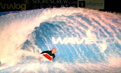
I've started a photography internship with www.discoversd.com, an online guide to San Diego. I took on a relatively advanced assignment even though I am still at grunt work level of the internship, just because the opportunity came up. I was to document an event at the Wave House, a club in Mission Beach that features a wave pool, with waves large enough for surfers. I don't understand the mechanics/physics, but I am reminded of a three-dimensional aquatic treadmill of sorts.

I was presented with the challenge of low-light photography, and I am not experienced with my flash. Thus I hovered around well lit areas and snapped pics of people there until a sympathetic professional photographer came over and gave me some flash advice.


A set of logos and signs for one of the Birch's summer camp series called Explore It! In this case, it is Explore It! Sharks. A mixture of vector drawing and recycled photoshop shark cartoons, also used in shark themed birthday party activities.


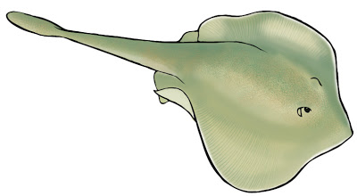
I've submitted my van designs to the powers that be, and am now awaiting feedback. Above is the round ray, the last animal illustration that I made for the project. I decided to make the front of the van the sandy bottom habitat, because the relatively horizontal surface of the van hood was conducive to showing off a more over-head view of flattened bodied fishes, typical of sandy bottom habitats. Such flattened animals include the round ray, flounder and guitarfish. They are flat of course, so that they can better hide in the sand.


The van tide pool side, complete with marine organisms. This composition posed a different challenge from the kelp forest, because so many tide pool organisms are tiny, and because the background is so much more visually complex than the kelp forest. I may still play around with this one. I think the red moss covered rock in the foreground has too much of a presence... I may slap an ocher star over it. That and the outline of the foreground rocks are too bold.


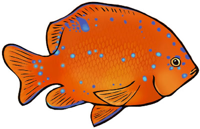
This is a juvenile garibaldi, cuter, much less hefty looking than the adult, and adorned with bright blue spots. The spots disappear as they age. Adults are very territorial, but seem relatively unconcerned about juveniles entering their territory. Juveniles live in tide pools; I assume tide pools offer more protection from predators than hanging around in the kelp forest, especially as juveniles are small, naive and brightly colored.


Here's the tide pool side of the van, in progress. You might recognize the tide pool backdrop as a previous tide pool illustration I created. I figured, why not tailor it to the van design, instead of drawing another tide pool? I did have to do a lot of digital cleaning up, because way back when I first did this illustration, my technique wasn't very refined - the black lines were a bit heavy and the edges weren't clean - and that original tide pool wasn't van-shaped. Also, there were the fish and sea stars to remove; they weren't drawn to the level of detail that I want for the van.

Freshly drawn animals will be overlaid on this image, including: spiny lobster, baby garibaldi, baby opaleye, ocher stars, hermit crabs, more mussels, maybe a scorpion fish or tide pool sculpin. And maybe a chiton or two.


After many hours of fish and kelp coloring, I finally got to cut and paste the whole thing together. I am very glad that I have a wacom tablet. The fish and kelp are on separate layers, so their positions can be readjusted. Actually, I'll have to re-compose the whole thing again anyways, when I get a hold of the real van template. I just traced this outline from a side-view photo of the chevy van we think we'll be getting. It doesn't take into consideration curvature, door handles, bumpers, etc.

Next: more fish & other marine critter drawing for the tide pool, open ocean and sandy bottom sides...


This is a leopard shark, named for its spots, rather than demeanor. As adults, they are about 4-5 ft long (that's 1.2 to 1.5 meters for you metric people), and are really quite harmless to humans. I know because I have snorkeled with these creatures, on a trip subsequent to the previously mentioned "terrifying" first snorkeling experience. I should explain that as a lousy swimmer, the most unideal place to be introduced to snorkeling in San Diego is off a rocky shore near to marine caves. I was at the mercy of the waves. Though I'm sure the marine life is fantastic there, the waviness and depths are more suited to confident snorkelers.

Instead, I recommend snorkeling at the sand bar in front of the Marine Room (a fancy beach front restaurant) on La Jolla Shores, just north of all the caves and the tide pools. One doesn't have to go deeper than 4ft before you can see leopard sharks, guitarfish and rays. They tend to stick to the sandy bottom, so you don't have to worry about collisions. And they eat things like crustaceans, not humans. They're particularly abundant in the late summer, ie. Now. A bad surf day is a good snorkel day!


This garibaldi is one of the animals that will be featured on the kelp forest side of the van. It was first penciled, then inked with a brush, scanned into photoshop, imported into illustrator to be vectorized, placed back in photoshop and colored using 3 layers, designated: line, color and scales.

Garibaldi are perhaps the most obvious inhabitants of the kelp forest. During my first (terrifying) attempt to snorkel in San Diego waters, I don't recall seeing much but I did see flashes of bright orange against the greyish-greenish-blue.

I went to Comic Con 2007 today. The conference completely sold out, I think for the first time in Comic Con history. Sundays are usually rather sleepy, but today was a mad carnival of costumes, comics, games, toys and crowds... I was not disappointed.

My first stop is always the small press area, with tables by independent artists, often self-published. Here one can talk to the artists themselves, as opposed to sales reps and publishing agents. Less jaded by years in the industry, these artists appreciate my time, and enthusedly speak with me about their work.

I bought five graphic novels/ art books:
American Born Chinese by Gene Luen Yang
Deogratias: A Tale of Rwanda by Stassen
A Girl Named Spark by PCP (Heisuke Kitazawa)
Incredible Change-Bots by Jeffrey Brown
Laika by Nick Abadzis


Here are some kelp fronds I've been working on for the van design. These will layered with a separate set of fish drawings. By the way, I can tell if you are led to this page because you are looking for an outline of kelp. If you are going to "borrow" this image, please at least post a comment and let me know what you're using it for. Thanks.


I camped at Sequoia National Park over the weekend. I look forward to outdoorsy excursions as an opportunity to take photos. On this trip, I was particularly fascinated by tree trunk patterns, whether cross-sections or on the bark. I wanted my photos to examine my subject trees at a level different from the standard Whole tree. They aren't quite micro-worlds, but perhaps they are relatively mini-worlds, on the scale of giant sequoias.


This was a sketch I did back in February when the I was first asked to design the Birch education outreach van. But only recently has the funding and organization surrounding it been more or less finalized, and I can proceed to the final designs. I now have more photoshop experience, as well as more kelp drawing experience. The kelp fronds I painstakingly put in the background now look scraggly to me. The fish could definitely use a make over.

The van will be used to bring the Birch to schools who can't make a field trip out to the Birch. So the idea with the van design is to feature a different local marine habitat on each side, so the van itself could be a teaching tool. This is the kelp forest side- the other long side will be tide pool habitat, on the back: sandy bottom, and front: open ocean. No I won't be painting directly on the van... the design will be printed on a giant sticker which will be professionally plastered on to the sides. The proper terminology is actually to "wrap" the van. Full wrapping of a
van (including giant sticker printing) is around $3500, in case you're wondering.

Apologies for not posting recently. It's been a busy July.


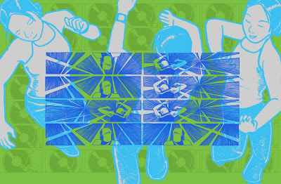
Here's another composition that I played around with for hours, and am still not sure that it feels complete. There are so many variations to choose from, it's hard to decide what looks best. I think my color choices come down to mood. At the start, the gray dancing figures were bright fuschia, but by the end I felt tired and the pink hurt my brain, so I opted for a silvery gray. Maybe the colors are too subdued for such an active subject matter? Anyways, I hope the aqua color schemes aren't getting boring. I will make an effort to expand my palette in the next one.

All the drawings are excerpts from my comic "Biceps", which was completed in April 06. Fortunately the comic was very image (as opposed to text) oriented, so there are lots of drawings to remix.


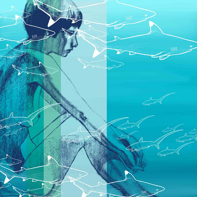
Whereas my previous 2 experimental images came together quickly and easily, this one took about an hour and a half to compose, and even then, I'm not sure I'm happy with it. I wanted to use sharks from a collection of shark drawings I just completed, but the composition consisting solely of sharks felt insubstantial, like a design for kids' wrapping paper. The longish shape and small faces of sharks made it hard for any shark to be the focal point of the composition, so I hunted around my scanned art folder for a more intriguing subject.

I found an old drawing of J, who was one of my favorite models for life drawing. The charcoal drawing of J is over three years old. I too, made her into a custom brush, which to my delight, captured the charcoal nuances (at least at a low res scale). Now I notice that I didn't quite finish her right hand, oh well. Anyways, for the longest time I kept J at a size that fit within the borders, when it dawned on me that expanding her beyond the borders would look so much more interesting. The strategically places colored stripes hopefully diminish the distraction of the sharks around her face.

As for the background, I pulled that from a kelp forest illustration I made a few months ago. Thank Photoshop for layers! I wanted a surreal quality. A calm image, in contrast to the average person's reaction to schools of sharks. The sharks are black tip reef sharks and thresher sharks, by the way.


I finished a set of plankton-related worksheets and signs, complete with a set of plankton icons for one of the Birch Aquarium's educational programs. Consequently, the theme of Custom Brushes Experiment 2 is Plankton. Zooplankton, to be more specific, as opposed to the photosynthesizing sort. I pulled up some older drawings of plankton from my image library. It was hard to resist going to town with the larval squid.

At first I had a photo background, featuring some sea grass sprayed over wet rocks, with the ocean and sky. It soon proved to be to visually confusing, so I replaced that with solid teal. At that point, I had the white jellies, gray larval squid and black icons. As much as I like limited palettes, it really needed a splash of color, so in went the red jelly.

I must say, the making of images for fun's sake is certainly fun! It's been a long time since I've experimented in art, just to see what happens.


Probably anyone with Photoshop experience will take one look at this and think: Looks like someone figured out how to use Custom Brushes. I'd been reading my Computer Arts magazine, and this issue, like all others, came with a CD with digital goodies. "Designfruit Photoshop brushes" caught my eye, and I uploaded them, and realized that they are simply designs saved as customized brushes, so they can be used almost as rubber stamps.

A quick Photoshop Help search actually proved helpful, and I learned that by selecting a design, then under the Edit menu, select Define Brush Preset, I could make my very own brushes. I quickly made a set using my own drawings, including the bat skull drawing I would have otherwise posted today in its traditional format. The result is Griffin & Sabine-ish (for you non-Nick Bantock fans out there, check out his art books...), and there looks to be much graphic design potential to be tapped from this technique.

Perognathus longimembris is the Pacific Pocket Mouse, with a teeny tiny little skull.

Depending on how long you've been perusing my blog, you may or may not be wondering, what are all these skulls for? The Mammal Atlas? OK so what's that for? You can find out a lot at:
http://www.sdnhm.org/mammalatlas/

Basically, there's been an initiative based out of the San Diego Natural History Museum to study the biodiversity of San Diego county (one of the most biologically diverse counties in the US). The information can be used for conservation plans, and understanding the effects of wildfire for instance. The illustrations are only a small part of the guide; there are also gps generated distribution maps, species accounts by specialists, info on conservation status. It's a huge collaborative project with some 30 contributors and 15 or so organizations involved.