Puma concolor, also known as Puma, Cougar and Mountain Lion. It's one of the few charismatic megafauna that I've had to draw. In illustrating this mammal atlas, I've come to appreciate the plethora of uncharismatic minifauna out there. Many of them are bats and rodents.

Now that I'm almost done with mammal skull illustrations, I'm wondering what to do with all the original drawings. It seems a waste for them to sit in an unceremonious pile on my shelf. The actual book only needs digital scans for publication. I could give some to select friends, maybe auction them off (I imagine all the whale skulls would be sold first). Some of my early drawings look so amateur to me that I wouldn't want anyone to see the originals (they have since been altered in photoshop, to be less ugly).

Mus musculus, the House Mouse! Another rodent with which I have had personal experience. A family of them made a nest in an empty area behind our kitchen cupboards. When we returned from a trip, we were clued in to their presence by a scattering of chips over a floor cushion, and a chewed chip bag. Then if we stood real still in the dark kitchen, we could hear the pitter patter of little mouse feet working their way through the cupboard woodwork.

There are not many more skulls to draw. Three years ago when I first embarked on this project, the prospect of drawing 80 sets of skulls seemed like a never-ending task, but the end is near! I will still have to edit the skulls, once the drawings have been run past a mammal skull expert. He'll point out things that I don't know, like that's a crack in the cranium, not a suture, etc.

Here we have a squirrel, Sciurus carolinensis. The Eastern Grey Squirrel, probably the squirrel that you're most likely to picture when thinking about squirrels. I was bitten by a squirrel once, when I was about 5 or 6. I was feeding a squirrel peanuts, and Chomp. My parents rushed me to the hospital, no doubt fraught with worry about the possibility of rabies. Oblivious to these concerns, I remember marveling at the purple antiseptic that dyed my finger. I did not have rabies.


Have you seen these crustaceans? Be sure to check them off when you do. Just when I was feeling pleased that I had covered many of the aquarium animals in my image library, I received a request for Striped Shrimp, King Crab and Decorator Crab. I threw in Sheephead Crab, for fun, since I wrote about Sheephead Fish yesterday. (correction: Striped Shrimp should be Banded Shrimp)

This is an excerpt from a scavenger hunt worksheet about exoskeletons. Yes, barnacles are crustaceans too! They just happen to be immobile as adults. Did you know that (according to my "Marine Biology Coloring Book", by Thomas Nieson) that the accumulation of barnacles to the bottom of boats can cause speed and fuel efficiency to decrease by 20 percent?


I have amassed a large enough image library of my drawings that I can draw from it when I get requests, instead of making a new illustration from scratch.

Today I am showcasing the California sheephead fish, a curious denizen of the kelp forest. They are curious because they can change sex from female to male, when they are eight years old. The sex change involves a coloration change too. The black and red coloration scheme that characterizes the sheephead in most people's minds is that of the male sheephead. They can live for decades, up to about 50 years old. Apparently they're tasty too. I know all this because I have read excerpts from the book "Probably More Than You Want To Know About The Fishes Of The Pacific Coast", by Robin Milton Love, which I recommend as am entertaining fish guide, even if he doesn't mention the Pacific Spiny Lumpsucker, possibly the cutest fish in the whole of the Birch Aquarium.

I added a new portfolio section to my website (jzeestudio.com) featuring a best of collection from the last few years. Check it out. This signifies my embarkment on a new terrain at more than a hobby level.

Recently, I have started automatically framing and composing scenes in my head even before I peer through the lens. These photos have been analyzed by some artistic process in my head. They are different from ones that feature my friends and family as the main subject. While composition and lighting are still important, the latter type of photo tends not ask my audience for a second look.

I spent the last 2 weeks eating pasta and taking photographs in Italy. Here's one of my favorite photos, taken while we ambled through the side streets of Siena. Maybe it's the frame-full of old, red brick that is so characteristic of Siena, maybe it's the simple pleasure of pigeon feeding that American tourists and local Italians alike enjoy.


This one was taken in Venice, also as we wandered off the tourist beaten path into the residential neighborhoods. The scattering of abandoned children's play vehicles was a great set up for a photo - the contrast of modern toys with historic buildings, the eerie lack of children...

I am going on vacation. Will be back in two weeks with more art!

Sometimes the Birch Aquarium education department takes certain classes on the road. When that happens, teaching materials such as those found on interactive websites have to be translated into a portable format (not every place has internet access). This tides poster was based on a website with an animated moon circling the earth, and the ocean bulges associated with the moon's position.

Feeling the Heat Exhibit, part IV


For each of the ideas that turns into an exhibit element, there are a host of ideas that are never realized. One of these lost ideas is the Climate Floor Game, a giant board game - hopscotch hybrid, that teaches kids what they can do to help reduce carbon emissions. If you do something green, like recycle your plastic bottle, you move forward. If you do something not green, like leave the water running while brushing teeth, you move back.

I based the design on a very similar game I saw at the Hong Kong Wetlands Park museum. They have excellent exhibits there; their conservation section was particularly impressive; it was packed with interactives that appealed to all manners of learning, though perhaps it was heavy on the tech side, which makes sense in the context of Hong Kong. Anyways.

We'd hoped to embed this in the carpet of the exhibit, so that while parents were absorbed with the more grown-up oriented exhibits like How To Use Sediment Cores To Understand Past Climate, kids could occupy themselves too. As it turned out, there was no space to accommodate a large floor game, so we thought perhaps it can be a huge roll-out canvas, for special teaching programs in the courtyard. But that never happened either.

Feeling the Heat Exhibit, part III

Here's another exhibit element from the Birch Aquarium's climate exhibit. After being inundated by the reality of just how bad the climate situation is, we wanted the visitors to learn, via interactive exhibits, that it's not out of their hands - there are things that everyone can do Right Now, at Home, to help reduce their carbon footprint.

First we conceptualized a Green house, like a giant doll house with parts that opened, closed, switched on and off. While exploring the house, tidbits of friendly information and tips would be revealed, like how much $$ one might save per year if you switched all your light bulbs from incandescents to compact fluorescents. You could open the garage and voila, a hybrid vehicle. On the roof, solar panels.

When it was apparent that floor space was limited, the design became 2 dimensional; like an advent calendar where kids could search for flaps that opened and provided info. Home technology was to be emphasized, like low-flow shower heads, energystar approved appliances, etc.

Finally, the design was overtaken by the outside design company, and they created a 2D house with rotating panels that revealed information as one manually turned the wheel-like device. The bright windows you see in the photo demonstrate the heat lost (energy wasted) by incandescent lights compared to fluorescent; place your hand on the window and glass and literally feel the heat.

Mammal skull illustration part IV

The near final stage is the Inking stage. Using a 0.05mm Sakura Micron pen, I outline the skull. At this point, I have to decide what I want to delineate using line, and what I want to show by with stippling dots. Generally, I only use line where there are hard angles, and on the very edge. I trace over the outermost outline with 0.1mm pen; I think the thicker edge helps emphasize the silhouette of the skull.

Once I anchor the skull using poster putty, using a desk lamp, I light the skull from the top left. This is simply how subjects of scientific illustrations are lit. Having a standard lighting direction means that those who are used to interpreting scientific illustrations will have an easy time understanding what shapes the shadows are indicating. If the lighting changes from illustration to illustration, one might have to think twice about whether a dark spot indicates a concave or convex shape.


I start by stippling the darkest areas of the skull. I can't go wrong in these areas. It's not a matter of mad dabbing of pen to paper. Each dot is actually placed with quick thought. When it comes to not-so-dark areas, I usually give a light sprinkling of dots over a large area, then go back in and put more dots where they are needed. When I first started learning how to stipple, I sometimes used a pencil to draw light isotopes, as if the skull were a topographical map, to help determine the concentration of dots to apply to paper. The inking portion of this illustration took 1 hour and 45 minutes.


A month or so ago a friend asked me to create an illustration for his doctoral thesis defense poster. Many years ago I'd been a grad student in the same ant ecology lab as he. I admittedly miss observing ants, and so the prospect of making
ant-themed art once again was appealing.

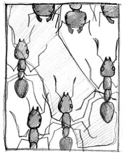
Four subjects were to be incorporated: Argentine ants (an invasive species), Native ants, California, and Water. I started out with a quick, thumbnail sketch (top left), to portray the idea of Argentine ants running across a map of CA, pushing native ants out of the picture. It helps to know a bit of the biology here to understand what's going on: Argentine ants were inadvertently introduced to the US from S. America by humans, and they are driving out native ants by various means, like competition.

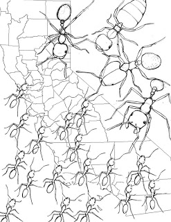
The concept was approved, so I did a more fleshed out version. I had a few ideas as to how to incorporate the Water aspect, such as delineating watersheds or showing rivers and lakes on the map. But as the design progressed, it was clear that I needed a relatively simple background, because the foreground layer was complicated enough with all the ants. Another bit of biology FYI: the Argentine ants are smaller than most native ants, yet because of their sheer numbers, as well as other reasons, the larger native ants can't compete.

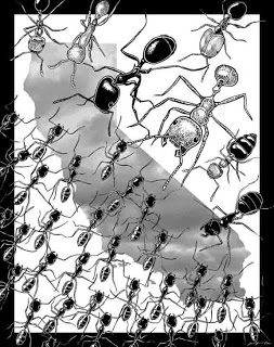
I decided to fill the shape of California with a cloud picture, provided by the grad student himself. I thought it made for a less obvious reference to water, and it would be nice to incorporate his photography into my illustration. The common names of the native ant species from left to right (across the top of the third image): Fire ant, Army ant, Harvester ant, a different Harvester ant, Big-Headed ant (how apt), Valentine ant (for its heart-shaped abdomen), Carpenter ant. The whole project took 14 hours.


Ants are back in my life again! This Pogo(nomyrmex) brings back fond memories of ant behavioral ecology days. Maybe it's the wide-set eyes and bull-doggish head shape that makes harvester ants cute. What's with the ants? Coming up next...

Feeling the Heat Exhibit, part II


Early on in the exhibit development stage (that is, the stage when the design committee, consisting of educators, scientists, exhibit designers and others) we learned that the Argo Project people wanted to be a part of the climate exhibit. The projects basically consists of thousands of torpedo-shaped floats that take measurements of its surroundings, such as salinity and temperature, at all or any depth of the ocean. Previously thought to be resistant to climate change due to its vastness, we now know that the oceans too are warming dramatically, down to deep depths. This has huge implications for the ocean current system around the earth, which in turn affects the climate.

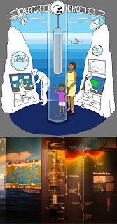
But rather than focus on the science data, which could be overwhelming, the original intention was to use the Argo Project as a showcase of new scientific technology that is being used to monitor climate change. So, the float itself was to be a center piece. Someone thought, wouldn't it be cool if the float was in a column of water, and if it rose and sank every so often.

I was asked to produce a concept drawing featuring the water column, an area that simulated an underwater environment, plus some interactive computer stations to the side, and a backdrop that included some radar-type communications relaying info collected by the Argo to some central station. The concept drawing would be used to present to potential doners at fund raising events, to show the Argo people what the exhibit might look like, and also for the design team to bounce ideas off of.

At this point, nothing is precise. A concept drawing is visualizing an idea. During discussions about what is going into the Argo Project area, pictures start forming in my head, and then when it comes time to drawing it, I usually have formulated a good idea of what the scene is going to look. I know what angle I'm going to show that will show off the elements, I know the image composition, I have an idea for a color scheme. I'm sorry I can't really verbalize how all that comes together; I've certainly not had any formal training in this. It may have come from drawing imaginary worlds as a kid. It's the same, except I have a set of parameters.

I draw in pencil, add some people who are looking happy to be at the exhibit, ink it, throw it in photoshop and drop in some color, and voila. The whole this is supposed to be relatively fast, since the sooner it's done, the sooner we can better tailor the exhibit element to our goals.

In the real version, the water column was scrapped. An engineering nightmare, apparently, not to mention a cleaning nightmare. The float is there, immobile and encase in a plastic box. The watery background stayed, though instead of depth the isotopes show, I think, water temperature of a sample transect. Notice the little radar scene is still there, and the computer monitors with maps became non-interactive wall panels. There is such thing as too many computer consoles in an exhibit - and they're expensive. To the far left, which I've cropped out of the photo, is a talking head. That is, a video of a scientist talking about his or her research. Too many talking heads are bad too, but we only have, oh, three main ones in the Feeling the Heat.

Feeling the Heat Exhibit, part I


Some insight into the design of the newest exhibit at the Birch Aquarium: Feeling the Heat; the Climate Challenge, which incidentally, was visited by Al Gore today.

As mentioned previously, the Keeling Curve was to be a central part of the exhibit, so it was one of the first elements to be designed. There were many challenges to interpreting the graph for visitors:
1. It's a graph. No-one feels like looking at a graph.
2. The units are unusual, as they measure CO2 levels in the atmosphere (not something easy to grasp like temperature).
3. The time scale. Keeling began his measurements in the 60s. From the 60s until now, CO2 levels have increased, but even more importantly, we had to show this data set in the context of geological time, to demonstrate that today's CO2 levels have never before been achieved in Earth's history (and how do we know what CO2 levels were millions of years ago? By using proxies, like examining gas bubbles trapped deep in million year old ice, extracted by ice cored... but that's a different story, which you can learn about at the exhibit).

The original exhibit design committee conceived of a large wall-sized graph along which visitors could walk, so as to absorb the pattern of the graph with one's progress alongside it. At the end of the graph, there was to be a "what next?" interactivity, at which visitors could estimate how high CO2 levels would be in 2050 should we continue on our gas guzzling etc habits as always. In my concept drawing, I threw in some iconic images showing technological innovations or social changes of the decade that led to greater CO2 output (for example, air travel really took off - haha - in the 80s). And we did not include geological time because 1. pre-60s data was not specifically Keeling's work and 2. using a smaller scale would better emphasize the "hockey stick" shaped graph - ie, the dramatic rise of CO2 levels in the most recent decades.

For the final design, with which I was not very involved, it was decided to include geological history in the graph, and visually, present CO2 levels are still stunningly high. The interactive asks visitors to see what CO2 levels might be, should we make, or not make changes in our carbon consumption. The CO2 levels is indicated by the lights on the smokestack, which turn on when you press one of 4 large, inviting, buttons. It seems that the CO2 units were not distracting from seeing the graph pattern and understanding the overall message.

While pretending not to follow the mom and her kids around while taking photos of them and the Keeling Curve, I overheard what would warm every museum educators' and exhibit designers' hearts. The mom described the graph to the kids, read aloud some of the labels but then re-explained them in kid language, and when she arrived at the end, she exclaimed "... and look! the carbon dioxide levels are higher than ever!" as she pointed at the graph, expressing genuine surprise; it wasn't just an animated voice for her kids' sakes. For you non-museum folk: An exhibit can do so much to draw kids in, but when parents get involved with the exhibit, and teach and learn at the same time, so much the more memorable experience for everyone.

The little I did directly do for the final version was to digitally cut the smokestack out of the original smokestack image, which had other stuff in the background. I did that for the plane and the van too, which you might see in the far far right, in the brown tinged wall piece.

This is turning out to be a longer post than expected, so I'll save the other exhibit elements for future posts. I realize that I've not talked about what "concept drawings" are, so I'll go into that later too.

Mammal skull illustration part III


Tracing the skull photos results in an outline like that faint one you see in the bottom right. The tracing part is to get proportions right more than anything else. I use a small table-top light box; you can get them pretty cheaply from art supply places these days. Before, I was restricted to tracing in the day time, against a window, or I'd hold my papers up to a lamp. That was before I switched to compact fluorescent bulbs and the heat from the incandescents would warp my paper.


Next, I pencil in the detail while looking at the actual skull. Oftentimes the detail hasn't been captured by my photograph. Though I try to light the skull as best as possible, details may be obscured by shadow. Also, the camera lens doesn't necessarily see what my eyes see. For example, the curvature of the back of the skull in the top view blocks the camera's "one-eyed" view of some of the details at the base of the back of the skull that I can see by having 2 eyes set apart from each other. For the top views, I draw one half and then use tracing paper to reflect that onto the other side. That saves a lot of effort.

On the left we have the Brown rat Rattus norvegicus, and on the right, the Black rat Rattus rattus. I'm starting to wish I'd done this Mammal skull illustration series when I was drawing kangaroo rats, which are much more likable, but alas. I do have a mountain lion/ cougar coming up. Anyways, I was going to point out that though to most everyone, a rat is a rat whether it's black or brown, the skulls are actually pretty different.


"Feeling the Heat: The Climate Challenge" opens to the general public at the Birch Aquarium this weekend. I was fortunate enough to be invited to the Donor and VIP opening reception last night. I hadn't been very involved with the exhibit since the conceptual design stage, which was last Fall. In the Winter an out-of-house team of designers and fabricators were brought in to help out, because we were way behind schedule. But more on design and such in a near future post. In short, I was really impressed by how the exhibit came together. You should go check it out for yourself.

In this photo you can see the iconic Keeling Curve in an exhibit; the data set that demonstrates that CO2 levels in the atmosphere have been achieving record high levels, higher than ever before in history, even when taking the extremes of natural fluctuations into consideration. You may have seen this graph featured in The Inconvenient Truth. Keeling happens to be a scientist at SIO, the Scripps Institute of Oceanography, the research of which the Birch interprets for the public. So, for many reasons, it was important that this graph have a impressive presence.

Next week, I'll park myself in the exhibit with my nice camera, and I'll get some pics of the exhibits I had a hand in designing. Stay tuned...

Mammal skull illustration part II

The first step is to photograph all the skulls in black and white. In most cases, I use the macro lens option on my digital camera. This rat skull is almost 2 inches in length but many skulls are much smaller, like those of bats, mice and shrews. Notice how the rat skull is kind of mean-looking.

I prop the skull up using a bit of poster putty, and lean it on a dark background for good contrast. I light the skull so that as much of it is illuminated as possible (unlike when shading the skull in the stippled drawing, the light comes from the top left corner but more on that later).

The top view photo is the trickiest; trying to get the sides symmetrical is harder than it looks. The best way to do this is to look at the negative space like the eye sockets, and to try to match them, or to angle the camera so that the suture down the middle of the skull is as straight as possible. The side view has a similar challenge - to capture what is as best as possible, one half of the skull. It's easy to rotate too much and show a bit of the underside or top of the skull. The jaw forms a "V" shape when viewed from the top, so the difficulty in capturing the side view is to make sure the view is parallel with the center plane of the jaw; an invisible plane that extends down the middle of the "V". This means that some part of the jaw photo will be out of focus since the front incisors will be further away from me than the jaw-articulation parts.

All the photos are cropped, adjusted for contrast and lined up in photoshop, and scaled to be 4.5 inches in length. The exceptions have been the whale skulls... perhaps I'm size-ist, but I thought the whale skulls deserved a larger drawing size. Anyways, the lined-up skulls are printed, and I outline the printouts with pen. This makes them easier to see in the tracing stage, which will be coming soon.


These 3 sets of five logos each are used to help orient aquarium guests participating in "Explore It!", a family-based program. The top set was used for Explore It! Tide Pools, the middle set Explore It! Ocean Potions (things to do with ocean chemistry) and the last set which I just made, Explore It! Corals. You'll see them on activity station signs and on the guide/work sheet hand out.

I wanted them to be easily recognizable, visually simple using black and white and only one other color, and to represent a concept or subject (pre-determined by Education people at the aquarium). A part of the challenge is designating black, white, and color areas, so as to create a balanced composition within a square frame. Some subjects, such as the ink-squirting octopus and clown fish, are easier to color-designate than others.

I use Illustrator exclusively to make these, and they do wind up looking Illustrator-y. Hmm, what do I mean by that... it's the quality of not being hand drawn; the images are smooth and slick; each shape has a blocky presence. But that's OK given the purpose of the icons. Below, you can see how they're used in station signs and procedure signs.
P.S. the font is "Junegull" from my favorite free font website: 1001fonts.com.