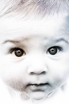
 Playing with my filters again, to fun artsy effect on this baby pic! And below, the original photo, unchanged in any way, straight out of the camera.
It's time to talk about composition. I often avoid discussing composition, because I compose without thinking. To translate whatever little non-verbal connections are going on in my brain into words is hard. Sure we talked about composition during critiques in art grad school. But I'm not in art grad school any more and I rarely partake in art grad school discussions these days.
The original photo is decent composition already. The almost uniformly dark background gives nice geometric shape to the negative space: nothing distracting there. The white-clad arms of the baby both "point" or draw the eye towards the baby face. And then bang! The eyes come straight out at you, and thus your eye isn't pulled anywhere else after that happens. Intentionally off-center and asymmetric, the darks and lights of the photo balance each other.
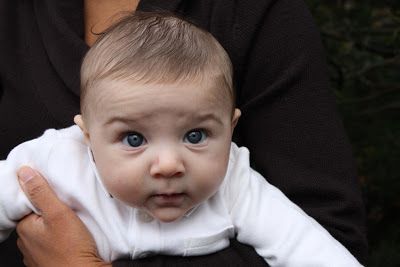
I did however, find the mom's hand and neck distracting. The baby eyes are the real strong point of the pic, so I wanted to zoom in and bring them to the forefront. When cropping, I had to decide between keeping the image landscape, or switching to portrait. In a landscape situation -assuming I wanted to keep everything from eyes to mouth in the pic, we'd also see the ears, part of the dark background, and the white onesie. He is a little hunched over, and the white onesie gives that body position away, and thus a viewer might be distracted by that slight posture discomfort, not to mention, the snippet of dark background. Portrait allowed me to cut all this extraneous stuff out. Ears are not important in this case. But if I cropped wide (ie, the edges of the rectangle really close to but not including ears) the face would look too wide, as if spread out on a flat plane. But crop too close to the eyes and the pic will feel unbalanced, with the 2 subjects of focus spread on either edge of the pic.
The pic is centered - though not perfectly so, for a touch of naturalness but centered enough for impact. The inclusion of forehead hair and chin frame the face. I blasted the whole photo with light to remove distracting shadows and worried forehead wrinkles. Deleted the tiny dark spot at the curve of the left cheek where the onesie collar meets the face. Converted to B&W - twice, for stark contrast. And threw in the filter for fun. What is the true color of the baby's eyes? Hmm!
Practical Advice when photographing babies: When your subject is a person (as opposed to the person and their environment, e.g. You in front of the Eiffel tower); ie The Baby - don't be afraid to get up close. Close enough to crop out all the distracting stuff (TVs, stray shoes, Ikea furniture, purse thrown on couch, sleep deprived parent). If your camera doesn't focus coz you're so close up to your subject, take the pic in hi-res and crop later.