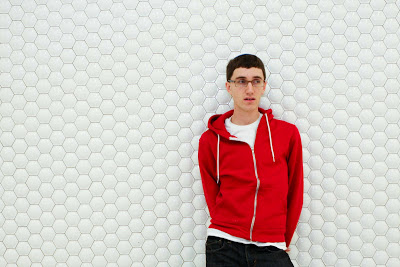
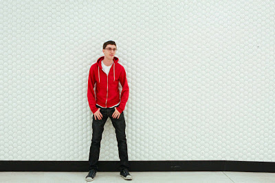
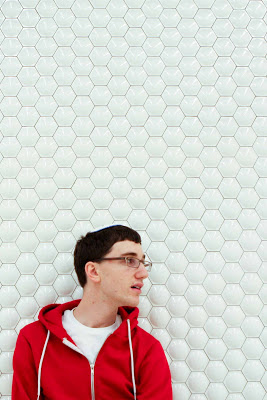
 I did a set of portraits for a local vocalist. From his descriptions, it sounded like he was looking for a surreal, graphic, minimalist style, and he had a location in mind: the bubble wall interior of the downtown SF BART stations.
Given a large, blank, textured wall, and one person, how does one make the image look interesting? A bold color certainly helps. And a non-stiff, stylish model. This was an exercise in composition. I could take all full body shots and crop later, but it is much more fun to experiment with cropping using the camera, rather than computer. When cropping, please don't crop at joints, especially wrists or ankles or necks. I think I've told you this before. It looks very uncomfortable.
Composing in this case, is striking a balance between the white negative space and the subject positive space. I don't know how I figure it out. I push the boundary of balance, without tipping the (+) and (-) space, I believe. Off centered photos are not simply off center - they are specifically off to a degree that my eye likes.
If you're interested in learning more about this vocalist, visit his website:
www.natankuchar.com
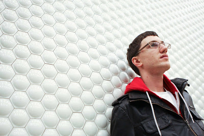
When a wall has a repetitive pattern, perspective/ angled shots can have great artsy effect. Try it next time, at a brick wall, chain-link fence, etc. But straight on shots have their own in-your-face impact.