After months of crafting and photographing, I was reminded today that drawing is my favorite art form. It's the one I have most experience in too, which means I'm not wasting brain power fumbling with technique - I can focus entirely on the drawing itself, and the pencil is a mere extension of my hand. Vision in head goes right to paper.

Actually, 2H pencil, or H pencil, or at softest HB pencil is a mere extension of my hand. This was a 2B pencil (I was working on site at the aquarium, and had limited pencil selection), thus I had a tiny bit of issue with technique. But soft graphite has it's place and it worked well in filling in the dark areas of these octopus sketches.

The Birch Aquarium Hall of Fishes will undergo an extensive revamping of information panels. Currently, all critter ID info is on a panoramic light box display above the tanks. Next year, instead there will be touch screen interactive computers at table-ish level to provide fish ID information and much more. So what to do with all the light boxes, hovering above the tanks? An idea was floated: to replace the text and fish photos with a large artistic graphic, photographic or not, to subtly enhance the appreciation of the animals on show within the tank.

The Giant Pacific Octopus tank will be the first to receive a trial run of both the touch screen computer and light box graphic, because Octopuses are just cool like that, to aquarium and non-aquarium folk alike. Thus I was asked to come up with some possible compositions for that light box. Here they are. The comic-like composition as a whole was unintentional, at least on a conscious level. But it occurs to me that these four panels could be read as a sequence.








There is something endearing about multi-legged creatures. I'd fancied doing an octopus screen print, but wasn't inspired until recently. A lot of my animal subject drawings feature animals doing normal, biologically accurate activities. So in this case, I decided to leave that comfort zone and go with something more artsy. I also tried to draw the Idea of octopi, rather than to represent octopi in a relatively realistic manner. What is the essence of an octopus? A large, bulbous head, long tentacle-y legs. So I left it simply at that, instead of including suckers, breathing apparatus, etc.

I knew the main octopus should be a solid color, and selected a few smaller ones also to be solid, based on composition. I wanted the viewer to be drawn towards the large octopus. The selective coloring does this, but also the octopus positioning; they are all swimming towards the central guy. This pulls the composition together, even though there are many separate individuals.

I'd had this screen print for a few days, but didn't find anything to print on until I perused the Target clearance rack. This Jovovich-Hawk (guest designers for the GO Line) scoop neck dotty T was perfect for a green octopus print... I knew it when I saw it on the rack. And luck for me, it was the only one, and in my size.


The Birch Aquarium annual Volunteer Party has a 50s theme this year. I was asked to design a program cover (above is an initial draft), and thus set about looking up 50s icons. It helps to think of some movies set in that era, like Grease and Back to the Future, and 50s music - Elvis, Beach Boys, for example. Juke boxes, diners, malts & milkshakes, roller skates, hula hoops, bowling and corvettes were items that came up when I quizzed a fellow Birch exhibits person about 50s icons.

It's more fun to draw women than men, as I find women's fashion much more interesting than men's, and this was a great excuse to look up what 50s clothes were about. Poodle skirts, high waisted jeans... high waisted Everything actually, buttoned shirts, with cutesy collars, saddle shoes, perky hair dos.

I pictured a symmetrical composition, and centered it around a front facing corvette. I googled 50s corvette images, but surprisingly couldn't come up with front facing corvettes. I actually dislike drawing cars, they're one of my weakest subjects, likely because I never draw them. Even harder to draw one without a direct reference. So with great reluctance I found a 3/4 view corvette and imagined what a front view would look like.


I screen printed the penguins onto some gray felt which had been sitting unused in my fabric pile for about 5 years (sewers, as in sewing people, will understand this fabric hoarding behavior), and whipped up a small 8" x 10.5" bag. It's lined to keep the felt from stretching (using a periwinkle blue lining fabric, also from my pile), but no pockets other than the main one. I noticed while shopping today, that the bag sagged funny, so I added a snap to the middle, which helped the bag keep its rectangular shape. Not the neatest job, but it's functional.

It takes at least 3 runs of the screen printing squeegee to get a good, dense amount of ink on felt. Otherwise felt is lovely to print on; no bleeding, very crisp edges. I broke a sewing machine needle trying to sew the handles on because I was forcing the needle through too many layers of fabric, but then switched to a needle intended for thick material and all was good. Pockets are a pain, especially ones with zips. I was too eager to have a new bag to bother with pockets, but perhaps in future designs.


Penguins are In right now, and for good reason! They're very cute. So naturally I wanted to make a penguin screen print, but there are so many penguin designs out there featuring upright, waddling penguins. Thus I thought, why not a design showing penguins at their gracefulest, in the water when they are in their element?

These diving penguins are based on the chinstrap penguin, a resident of Antarctica. I picked them for their markings... I wanted a face that wasn't completely dark. I drew this out in pencil first, but wound up cutting out the individual penguins and rearranging them for a more interesting composition. The solid color of penguin backs made for a nice print.


This mountain lion happened to lounge against the glass separating its enclosure from the human viewing area at the Living Desert Wildlife and Botanical Park, Palm Springs. Armed with a 25-75mm fixed 2.8 aperture, I tried taking some portrait shots on Sports mode, as s/he was moving around quite a lot. The blogspot uploaded pics have lost some contrast, but s/he is pretty gorgeous nevertheless! I wish I'd included at least part of the ears, but when opportunities like this come up, there's not much time to think and I just jump in and snap as many pics as quickly as possible. Sure enough, s/he got tired of lounging before long and sauntered off into the exhibit. This also would've been a good opportunity to try using RAW file format instead of jpeg... but again, no time to think!


The craft show hosted a little fashion show, featuring clothes from some local North Park boutiques, as well as a sampling of items available from vendors at the craft fair. My Origami Cranes t-shirt, worn by a select model, had a few seconds of fame on the cat walk. I don't think it served much advertising purpose though, as it's not like viewers are listening to the announcers and taking notes as to whose clothes are being shown off (not to mention that "Mastodon" was mis-pronounced, is it really that unusual a word? I mean, it Is the State Fossil of Michigan). But it was fun anyways. Of course I couldn't resist photographing other models too, as I now instinctively take photos at fashion shows, whether I'm asked to or not.


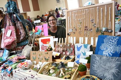
The North Park Craft Mafia Spring Line Up was my first craft fair. I shared a table with a co-crafter, pictured above at our little shop. She makes bags and little baby blankets and books. I liked our display, which seemed piled and cluttered with stuff (not unlike my desk) - seemed more inviting than displays that were flat and neat. However, improvements could be made to the display, for example: the t-shirts should be hand and more prominent (I don't think it was apparent that they were t-shirts), text could be bigger (people didn't realize that the wood decoupage tiles included individually hand drawn drawings, even though I'd included a little sign), and I don't think that anyone noticed the lamp worked pendants at all.

Pricing is difficult. Artists always tell other artists to never undersell one's self, and in the long run I'll be glad not to have done so. And considering the time / skill / investment in materials, hand made stuff really shouldn't be cheap. But people don't go to craft fairs planning to spend a hunk of money at once. So there's a balance to be struck.

2/3 of all sales were made to friends!! Thanks to all of you who came out to support us. Thus, if I do multiple craft fairs per year, I should probably expect to make 1/3 of what I did, as I wouldn't expect friends to come out and buy something every time. Then again maybe not; now that I have a better idea of what "random" people like to buy, I can focus on expanding that collection of items and make more sales. I referring to the wood decoupage tiles. Almost all of my Random sales were of either Avian Life or French Cats decoupage pendants. It makes sense... there was a lot of beaded jewelry competition, but the decoupage tiles were completely unique.

Anyways, I'm exhausted.


Logo design. Something I should have thought about a long time ago, but didn't. Only 3 days until Craft Show, so I figured I'd whip one out on Illustrator as quickly as I could, and make different color schemes. Did these in about 1.5 hours. Good enough for now! They will hopefully be printed as stickers, and given out for free.

The mastodon basically looks like an elephant in this logo, but that's OK, people like elephants. I thought it would be too confusing (and too wordy) to put both "Mastodon Garden" and my website on the sticker, so I only included my website address. I could eventually buy a Mastodon Garden domain name, but "Mastodon Garden" was thought up on a whim too... perhaps I should put more thought into marketing!

Blossoms because there is a Korean vase with blossoms on my desk, and they look pretty, ginkgo leaves because I like the name, I like the shape, and I think ginkgo trees have been around for a long time relative to other trees.


I've made 70 decoupage pendants over the past few days. The process has its tedious parts, such as drawing tiny animals in pen and ink, cutting tiny animals out of rice paper, cutting out fabric shapes to fit wood gluing it all together (3 layers of glue: between wood & fabric, fabric and paper, and over top of all), fitting in the bail, finished with 2 coats of varnish. Then it dries, and I string the cord through it, tied with size-adjustable knots. Hmm, actually the whole process is tedious. Double tedious with double-sided pendants such as this.

Countdown 6 days until the North Park Craft Mafia craft fair! I have yet to make anything related to display. I had great plans to hang necklaces from a fake topiary, but we shall see if that happens.


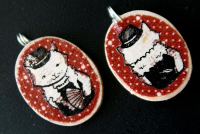
Another French Cats pendant. I debated over what weapon she should be hiding behind her back. A dagger seemed slightly cliche, so I thought about: axe, cleaver, revolver, lead piping, but in the end, dagger won out. Feline Fatale.


French Cats are back. Each pendant is two-sided, with a cat portrait on the front, and something that suggests a story on the back. The skeleton cat may be a bit morbid; I was thinking of Disney's Haunted House portraits at the time. If you're familiar, you'll know the portrait of the young woman that morphs into a gaunt, deathly looking old woman. That one might appeal to the goth crowd. I'd been wanting to make story telling necklaces for a while, and thought it might be fun to have a multi-pendant, ie, multi comic panel necklace. Maybe later... this is just a start.

I didn't know what a "bail" was until recently, when I realized that I needed to attach a Hanging Loop Thing to the top of the wood pendants so that they might hang from a cord. Hanging Loop Things are also known as bails, and I couldn't find a cheap source of them. I decided to make my own out of twice looped wire, with the ends pointing downwards like a "p" (or "q") shape. Using my old wood carving tools (from wood block printing days) I carved out grooves on the back surface of the pendant, so the leg of the "p" fit in almost level to the pendant back surface, and the loop sat over the top of the pendant. I glued the home made bails on, and the grooves and such are hidden under the fabric layer.


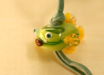
Sadly, this little guy exploded not long after this photo was taken, and he now resides in the trash bin. As it turns out, the integrity of his internal composition had been compromised even before he developed fins. The core is a large bead, onto which details have been carefully applied. Fins were flattened using a pair of tweezers, lips dented by pressing a blade horizontally into a blob of red glass. The difficult part is keeping the central bead warm and happy while applying the details, which I did not. Consequently, the over cooled bead cracked internally, and even once annealed (in the kiln), the pressure of having a cord pulled through the center of it was too much to bear, and his face fell off in too many pieces to glue back on.


Here is another Paris shot. I'm in the square in front of Notre Dame, which would be to the left of the photo. Paris makes for good night shots, as buildings and streets are well lit, but not lit by neon. But what actually makes this photo work is the woman in the white jacket. The lamp posts in the distance to the left lead the eye up to the nearest lamp post which with is brightest light, is domineering. There we would be stuck and unbalanced, in an uninteresting part of the photo, if it wasn't for that woman's white jacket. The eye is pulled down, and suddenly the viewer notices people in the image, and lamp posts in the distance, which lead the viewer back to the left of the page. This composition forms a continuous triangle. There you go, a quick tutorial in composition.


I am making multiples. I will have a half table at the North Park Craft Mafia Spring Line Up craft fair on March 30, 2008 (a juried show! I am pleased to be accepted). Thus I am building inventory. Just in case things sell well, I wouldn't want to run out too early! I actually have no concept of how many of what to make. I know which designs are more popular, and thus I ought to make more of those. Perhaps I will just make and make and when time runs out, I'll just sell what I've got.

For some reason, shades of purple are coming out really badly in this photo. The butterflies are supposed to be amethyst, and the light colored leaves are pale purple. This is what I get for lazily lighting my subjects with desk lamp, I guess.


I went to Paris and some cities in Provence (hence my prolonged absence, apologies to my regulars for the lack of posts). Of course I took many photos, around 600-700, which is less than I expected I'd take. I have two 2 gig memory cards, and have yet to fill one up in a trip. I do use the smallest file size, as I don't expect to be blowing any images to poster size. And I've yet to shoot RAW; I'm a little intimidated. Also, my computer is slow enough without having to process large files.

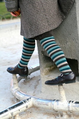
Anyways, the photo above is one of my favorites. Sitting on the edge of a waterless fountain sipping an Orangina at Place de Vosges (how to pronounce??) on a Sunday afternoon was an excellent Parisian people watching opportunity. The fountain was a magnet for kid activity; soccer ball kicking within the low fountain walls prevented the ball from going far; speeding tricycles veered around me, and the fountain spouts and piping were stepping stones and balance beams respectively.


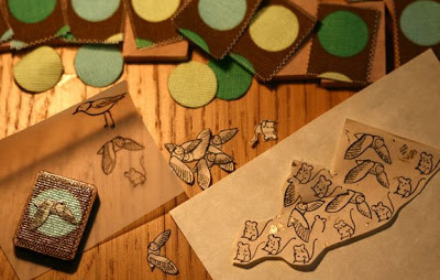
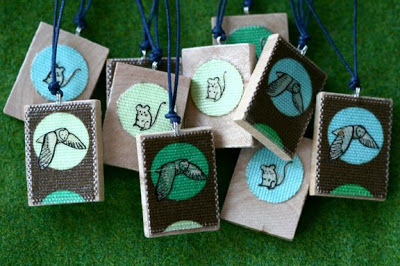
I'm running out of different fabrics with which to pair with birds. Each tile is 1" x 1.25", so the birds have to be pretty darn small. Working on rice paper with pen & ink can be tricky, as the paper is very thin and allowing the nib to rest too long on the paper results in a splodge of ink. The metal nib also picks up paper fibers, which can also result in a splodge of ink.

The fabric isn't randomly cut; I select rectangles of pattern that I think will make for good compositions when combined with a bird.


I photographed a week-old baby. There were several challenges, the first being lighting. Being immediately next to a window or under a skylight would be ideal, but the location wasn't the brightest spot, despite the uncovered windows. Electric lighting and flash looked awful on the baby, which made me wish I had more sophisticated lighting equipment, but I made do with my 100mm f/2.8 at ISO 400 or 800. This photo wasn't intentionally unfocused, but I liked the soft focus result anyways. The other baby challenge was waiting for the moment that he was awake with eyes open and not crying, and not being bounced to discourage crying. I had to be opportunistic.

Young babies tend to be a little mottled pink, which perhaps could be evened out with lighting? I'm not a big fan of pink anyways, so I prefer converting to B&W.

PS. I think I've just experienced Spam Comment Posting. Don't bother clicking on the comment below, it makes no sense, links to random sites and the profile of the user is empty with a nonsensical name.


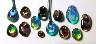
Above are beads still on their mandrills. Mandrills are metal rods with one end coated in bead release, which is some sort of clay. It coats the inside of the hole that goes through the glass bead, but otherwise, the rest of it breaks off the mandrill pretty easily. I started making drop-shaped beads, which make for nice pendants. Drops are made by allowing the molten glass to blob down to one side, but without letting the "top" of the pendant get too thin.


I'm very excited about the possibilities for this. I'd been pondering a way to put my drawings on potentially jewelry-making pieces. I bought wood tiles from Michael's, as well as Mod Podge (Matte Mat; "waterbase sealer, glue and finish...") and Delta Ceramcoat Varnish ("a durable protective finish"), dug out some rice paper from my paper collection, and quickly inked out some doodles using speedball superblack ink and an ink-dipping fine nib pen, which I use for comics. I did the French Cat first; cut him out and glued him on the wood piece, then covered the whole thing in varnish. The rice paper disappears (dissolves?) as it is so thin (I learned this technique when I had to paint a surfboard design; they asked for the design on rice paper, to be covered in resin or whatever), leaving the ink on the surface.

Next I tried a fabric version. This is nothing new; it even has a fancy French name: Decoupage. Glue fabric on, slather with varnish, but I also added a little drawing. I know, flowers and hummingbirds, so cliche, but I was in a hurry to try out the technique. It works! Now I have to figure out how to make it into a pendant.