At the Birch Aquarium exhibits dept, we are busy churning out graphics for the upcoming Shark Week as well as the annual volunteer party, this year with a 50s theme. The large format printer is chugging away at 100" long posters, at this very moment, churning out the top "Welcome" poster. The original design is on the bottom, by another designer. As always, I was supposed to just print out the poster, not edit it, but I couldn't resist. I felt like it could use a shot of pizzaz... it needed to be tied together. Plus, I have strong feelings against clip art.

So... I changed the font size to emphasize "Welcome, de-emphasized "to the", and enlarged "Fab 50s", additionally further enlarging the "F". Put the whole thing at a slant, and made the text fill the whole poster, since the welcome message is the whole point of the poster. I got rid of most of the distracting clip art which drags the viewer's eye all over the place, but kept the sundae and music notes, and repeated and placed them so that they draw the eye towards "Fab 50s". Whittled down the color scheme to pink and white, re-used the oval motif, but this time to emphasize only "Fab 50s" and not 4 different clip art images. I thought the turquoise showed off the pink and white lettering nicely, and the tilt of the oval balances the opposite tilt of the text.


When I first reviewed my photos on the screen at the back of my camera, I thought the shape in the bottom left corner was a palm tree, as palm trees have their way of sneaking into San Diegan photos. But no, it was the top of a guitar, which made the photo all the more interesting, I thought!

The award stage was terribly positioned in terms of photography. It was strongly back lit by the 6pm summer sun. We were on a Del Mar rooftop with no shade. This is when daytime flash comes into handy. Had I not used a flash, this image would've consisted entirely of shadow. I like the contrast of dark and light dresses, how the white dress disappears into the bright light, the strong presence of hands (I wish I'd not cut the left hand of the white dress woman off), the intensity of the embrace, and the slight awkwardness of the glass award sandwiched between the women.

I was at the City of Hope Wine and Food Festival, a fund raising event for a local hospital/medical institution. The woman on the left, a 7 year breast cancer survivor had just been named the new Ambassador of Hope. There were about 15 wineries represented, some offering food specialties. Tickets were $55, and guests cruised around the Del Mar Plaza rooftop with wine glass in hand, socializing and signing up for various silent auction items (silent auctions are So In right now!) such as spa packages and photo portrait sessions.


Imperial Beach is the southern most beach in San Diego before the border. I'd never been there before, but I drove down today to photograph the US Open Sandcastle Competition. However my favorite photo wasn't of a sandcastle, but rather of a girl ambling under the old wooden pier. The photo didn't capture the depth as well as I'd liked. In real life, the wooden beans faded into the distance, almost lost in a blue mist towards the end.

The event was packed; surprisingly lots of people - low thousands perhaps? I'm bad at estimating these things. I didn't stay for the judging. But there were some 20 competitors, each with a caution-taped off square of, oh, 20 x 20 ft? Teams of on average 6 people worked on castles of all different themes. The picture below isn't the most artistically interesting pic, but I figured I ought to post a photo of a sandcastle.


Fun activity for you: Put the above images in order of which animal you think causes the most to least human deaths.

I've spent the week producing graphics for the upcoming Shark Week. It hasn't been very exciting, as the logo has already been designed, and the color scheme and design feel have been set. So making signs has consisted of placing the logo, and incorporating the new text while using the old design scheme. I freshened things up a little bit. But the more slightly interesting design project I had was to make a set of cards: on one side, an animal, and on the back, the number of human deaths caused by that animal, per year. These cards are for a game in which guests put the animals in order of highest death causer to lowest death causer, and then turn the cards around to see if they're right. Scroll down to see if you were right.

FYI, Wikipedia says that in the US, there were 42,884 deaths caused by car accident in 2003. As for lightning, a quick google search (without checking out the validity of any of the reports) - around 60-80 deaths per year in the US.


It's about time I started a Dog series of decoupage wood pendants. My first one was the top circular pendant featuring my very own Charlotte on a floral background. I picked a few other dogs that I thought would be fun to draw. These are decoupage pieces as before, but in addition to the pen and ink to outline the dogs, I used an ink wash with a paintbrush to give a sense of the coat patterns.

I figure people would like to have individualized pen portraits of their own dogs. I'm contemplating the idea of making such pendants on the spot, say at a craft fair. Everyone has cell phone pics of their dogs these days - I could whip out a drawing in five minutes. It's the pasting and layering of glue and varnish that takes a while. The fabric backgrounds on wood could be pre-made. Just wondering aloud.

The Birch Aquarium gives back to its volunteers when once a year, the Birch staff volunteer to throw a party for the volunteers. This year, the theme is the 50s.

The program cover is always hand drawn, and this year I was asked to design it. So here's one of the versions. I found a handful of different retro fonts, so the other versions use other fonts. Dafont.com turned out to be quite useful.

It's been a while since I did such an extensive pen and ink drawing, comic style. Cross hatching is not my strength; it's easy to get carried away and put in too many lines, resulting in a flat, dark shape. It's also hard to achieve a range of gray scale. I didn't want to deal with cross hatching skin tones, so I did that in photoshop afterwards.


There were many dogs at the Ocean Beach (San Diego) Street Fair, but this one was practically camouflaged amongst the many frilly things in the stall. S/he lay on a table top like a stuffed animal on display.

There are perks to my photography gigs, such as having the opportunity to eat my subjects. Thus, I was very happy to be assigned to photographing the pastry chef and pastries at Heaven Sent desserts, in North Park (San Diego) at 30th and University.

I did not eat the Chilled Passion Fruit-Verbena Soup (top; with french kiwi, poached pineapple, tapioca pearls and mint, served with a creamy coconut panna coffee) but I did sample the Malted Milk Chocolate Pudding Parfait (bottom; with caramel bananas, chantilly cream and vanilla cake crumbles). I couldn't finish it all, so I got it to go, and the server warned me that it wasn't going to look pretty when dumped in a plastic cup. That's OK. It's the same to the taste buds and stomach.

Tina Luu, the pastry genius behind these delectable desserts, does not consider having her photo taken to be a fun activity, but she was nice about it and I managed to get a few good photos when she started laughing at the situation.

You'll see these photos in an upcoming issue of Asia Media, available at a fine bubble tea shop near you...


Here's the tide pool side of the Birch Aquarium Outreach van design. Hmm, I think the sand needs to be darker so that the text stands out more. The spiny lobster needs some shadow beneath it. And the lobster could be more orange too. I wasn't sure how many little critters to include; tide pools are packed with 'em (hermit crabs, snails, shrimpy things), but I don't want this design to get too complex, and one wouldn't see the detail of the little animals when say driving past this van, anyways.


Asia Media Inc. gave me an editorial assignment - provide a photographic illustration for an article about Asian American Women Attorneys and the dual challenge of the glass and bamboo ceiling. I wasn't sure how to proceed; how was I going to coordinate the 3 attorneys mentioned in the article for a photo shoot? But then I was told I could use models.

So, I rounded up 3 friends, all of whom happened to have suit-like outfits and business-y accessories and we met up in downtown San Diego, at the Courthouse building. Which turned out to be incredibly ugly, so we shifted down the block to the Justice building, which had those grand white columns one expects of a law-related building. I wanted a sense of perspective in my image, so I combined strategic positioning of women with the stretch of white columns. In some case I made use of the stairs too, to suggest upwards movement.

We attracted a lot of attention from passing tourists, including one man who offered to take the photo so that I could be in the photo too.


I am rarely in a building consisting of more than two floors in San Diego. Maybe that's why this photo looks to me as if it weren't taken here. In fact, it's an apt complex in Little Italy, and you can see the bride and groom walking along the very industrial looking walkway. This was probably the most unusual photo that I took at the wedding.


I photographed a series of headshots and group shots of the main people behind DiscoverSD.com, for marketing purposes. Someone had decided that Universal, a club in Hillcrest (that the night before had just hosted a celebration for San Diego's first gay marriage!), would make for great backdrops. The club was swathed in pink, red and black decor, had left over party balloons and feather boas strewn about, and had some unusual lighting elements such as these back lit flower photographs on the ceiling. The group stood on coffee tables so as to reduce the distance between their heads and the flowers.

The difficulty of group photos is what should people do with their hands? I didn't think about it at the time of shooting, but next time I will think about giving more hand and arm direction.


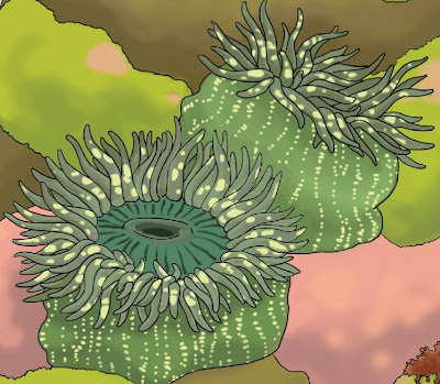
I am still spending all my hours finessing the Birch Aquarium Outreach Van design. Now I'm working on the tide pool side, and feeling a bit regretful that I incorporated so many anemones! But it will look cool when it's done. Knowing my art will be driven around San Diego, and will most likely be the most noticed van in the county, is pretty good incentive. Someone mentioned that I ought to work my name into the design some how.


Here's the latest Kelp Side design for the Birch Aquarium outreach van. It's vastly simplified from previous designs, where I felt I had to put in as much kelp as possible. I might put in one more, and maybe some green shadows to suggest kelp in the distance, but I realized that I don't need to take kelp forest so literally. Note that none of the design, aside from the blue water wraps around the corners of the van. This will make things a lot easier.

Resolution is funny. If say a fish image is printed really small, then it's OK if it's low resolution, like 100 dpi. At medium (letter) or large (poster) size it does matter, because people will notice the pixelation, so 300 dpi is good. But once you get up to ginormous size, ie van size, resolution can go down again because people generally only view the van from far away, and can't make out the resolution. Thus the van image is 100-150 dpi.

I have been spending all my hours redrawing kelp in high resolution for the Birch Outreach Van. It's been a year since I drew the original low-res kelp, and I have since paid more attention to kelp anatomy, and realized that my early drawings were a bit off - in terms of where kelp blades (leaf equivalent) part from the stipe (stem), how far the bladder (blublous thing at the base of the blade) is from the stipe, and the ridges along the edges of the blades, oh and the width of the stipe too. So along with redrawing, I changed a lot of the details.

Here you see a kelp frond in the midst of being changed. There are 2 intertwining fronds instead of one, and I'm adding ridges to the blades. There are 3 photoshop layers: the black outline, the color of the kelp, and the blue background, which makes it easier to see where I've colored the kelp outside the lines.


I went to a wedding. I wasn't the photographer, but naturally I couldn't help but take photos. I rather like this photo. I converted to stark black and white (not much gray scale). I like that both the perspective of the aisle and the direction people are looking point you towards the freshly married couple. Of course it would've been even better had the couple been walking towards me, oh well. Since we see their backs, I think other details become more noticeable, such as the bubbles, and all the cameras. I wonder if it is weird to marry, walk back down the aisle to face a sea of cameras rather than meeting people in eye with smiles.


The gray whale skull has been residing in one of the SD Natural History Museum education rooms, and I'd been waiting for an opportunity to photograph it for the SD County Mammal Atlas Project, so that I could draw the skull from the photograph. The opportunity arose when during the installation of a new exhibit, Water: A California Story, the skull had to be moved around anyways. A crew of about 8 people were enlisted. The entire platform was lifted onto rolling boards, and it was transported to the atrium, whereupon I went up a floor and leaned precariously over the balcony railing to get an eagle eye photo of the skull. 

These are the paper types that comprise my wedding invitations. From top:
(1) 100% recycled handmade paper by Green Field Paper Company, based in San Diego. I went to the warehouse (near Clairemont Mesa and the 805) to buy a stack of this paper, and I got to see their huge vats of pulp and old school paper press. They also make cards and stationery. A little pricey but it's unique and good for us.
This particular paper is embedded with wild flower seeds, so when you're done with the invitation, you can mash the paper into pulp with some water and plant it. It's a heavy, card-like paper with lovely texture.
(2) blue paper, possibly handmade, but printed with a Chinese-motif-like cloud design. From Blick Art supplies in Little Italy.
(3) Strathmore tracing paper, from a pad of 50 sheets. These will have text printed on them.
(4) 100% recycled paper envelope also from Green Field, no embedded seeds.
They're bound together by a raffia-like paper ribbon that will go through some holes at the top of the invite.
I considered buying invitations, and shopped around for recycled paper cards, but I wasn't very excited by the designs, and even for the cheapest of invitations, one winds up spending a small fortune (and those cheap invitations do look cheap). I figured, I'm a professional artist, I should design and make my own! And, I do like paper shopping.


It was the earliest I'd ever gotten up for a photo shoot. Down to Balboa park at 6:15 am on a Sunday, to catch the start of the Rock N Roll Marathon at 6:30. There were masses of fans, but thousands of runners! The throng of runners backed up several blocks behind the starting line, and it took quite a while before everyone passed through.

A bike proved to be very useful in the spectating and photographing of this marathon. Lots of streets were closed to cars, so armed with camera and bike I sped downhill from Balboa park to down town to photograph in the Gas Lamp district. Then crawled back up Park and over to the Prado bridge, where I got the photo above. Next, put the bike back in the car and drove over to Rosecrans near Sports Arena, and biked to the San Diego river, where the runners had already gone around Mission Bay, and were already at the 20 mile mark. I was very impressed.

I never caught up with the elite runners. The fastest man finished at 2:10, and woman and 2:28. That's 26.2 miles in less than 2.5 hours?? I can't even do one mile in less than 6 minutes!

Photographing was very fun. A chance to capture some San Diego scenery at the same time as lots of people. Biking was also very fun. Got a kick out of biking on closed major roads and freeways. But it was just amazing to see so many people with their hearts set on such an ambitious goal.


I did some brochure photographing for the Birch Aquarium again today, this time assigned to a shark class and a mollusc class. This girl was by far the happiest kid in the shark class. She was beaming the entire time, at all three stations, and she was particularly thrilled to hold the shark puppet in the 6 shark senses activity.