I've been thinking about fabric necklaces for a while. Not just a fabric centerpiece, or fabric beads/ components, but an entirely fabric necklace. I cut out various U-shapes using scrap paper, tweaking it so that I came up with a version that sat nicely over my clavicle, and the arms of the U draped slightly over the apex of my shoulders. I didn't want it too wide (and bib-like) - yet it had to be wide enough to not twist or fold like a piece of thick ribbon.

The backing is felt, to give shape to the necklace, and the front is printed cotton. I matched it to the background of a decoupage bird wood tile that I made a few months ago. The matching makes the otherwise slightly chunky centerpiece more subtle. I'm pleased with the result. I've not yet seen anything like this in the crafty jewelry world.


My second craft fair = "Craft + Destroy". I shared a table with my co-crafter of charinacharina once again. Now I have a reference when people ask me how well a craft fair went. The first one went better than this more recent one. The more recent one was much smaller, and cheaper to rent a table too. A few changes to my display: use of 3 microphone stands, 2 to hold up a clothes line stretched across the table, and one to serve as a t-shirt rack. I brought along a laminated garibaldi and pinned him to the top of my jewelry display.


American Marketer of the Year Award (May 22) - with awards presented by Lee Ann Kim (right), news anchor of San Diego Channel 10. Asian Heritage Awards (May 10) - awards presented by Marcella Lee (left) news anchor for San Diego Channel 8. They have similar hair styles and coloring jobs, not to mention both are wearing dark gray outfits. They appear to be of similar age. They both are into kid adoption: Lee Ann has an adopted kid, and Marcella promotes adoption on TV. Oh yeah, and they're both Asian American women! It wasn't surprising in the case of the AHAs, but for the AMYs, it was nice for Lee Ann to represent, as there were few Asian Americans in the room.

I can't help but think that they fall in line with the Connie Chung stereotypical news caster look. Maybe all newscasters of all ethnicities fulfill some stereotypical look, but I only notice with Asian American women. In any case, they were both smart and sassy, and it was inspiring to see them live - they're real people! I didn't get to meet either though; they both always had people talking to them.


My first mass published photos! The Asian Heritage Awards was on May 10th, and I turned in my photos on May 11th so that the Asia journal folks could get to work on putting together this issue. The photos consist of pics by myself and fellow photographer Everard. For some of the pics, I'm not totally sure which are his and which are mine, as we were often standing in the same area. But no matter, we have a satisfyingly big byline. This publication can be found in a lot of Asian restaurants and tea places around San Diego


Another craft fair around the corner. I'm introducing tote bags to my inventory; they're organic cotton with a printed fabric applique. Making use of the many scraps of material lying around my studio.


The Van is finally here! A year ago, (see July 20, 2007 entry) I was asked by the Birch Aquarium education department to provide a design to be wrapped around a new outreach van. I did some draft designs to be used as proposals, and the donors approved. I guess it took a while to get the donated money, to pick a van, acquire the van, find a van wrapper.

Now the challenge is to size my images up. Original fish images are about Letter size, at 300 dpi, which is high res, but the van is 244 inches long, and images are needed in 100-150 dpi. I don't want to re-computer-draw everything. So I used the Magic Number: 116.18. This multiplier works to enlarge images without losing as much quality as other multipliers, for some magical reason. So I multiplied this garibaldi by 116.18 several times until it was the size that it would be printed for the real van, and printed it out to see how pixelated it might be. I taped it on the van (left pic). It wasn't bad at all! Good.

The right diagram is a template provided by the van wrap company. I'll need to fit my kelp forest scene on there, but it's more complicated than that because my design is a continuous 360 degree illustration. I'll have to figure out how this is going to work...


A poster, the original design on the RIGHT, was passed to me to be printed and mounted. As usual I gave it a critical eye and decided I wanted to make some changes. One day the original graphic designer is going to notice that his or her posters are changed before printing, but until then, as long as posters pass through me I will exercise my graphic design skills! My redesign is on the LEFT.

COLOR: I kept the purple background, and I liked the effect of light blue on purple. However, the electric blue and orange and 2 shades of light blue as well as black and white, was too confusing. As a viewer, I'm very distracted by the orange. I see the Date, then skip to the "John Hannah..." and then "Evolution in Action". The Title of the lecture (ie, a really important part of the poster), disappears in black text on dark purple, and the photograph bleeds into the background purple too. So, I changed all text to a clean white and light blue.

FONT: Count the fonts on the original. Not just fonts, but also note the font shadow, font outline, font glow effect... on top of all the colors! There lacks a cohesiveness. I stuck to 2 fonts: Futura (everything except "Bugs & Bytes") and Georgia. No shadow/ glow effects - much cleaner. Used either color and/or font size to emphasize important info.

COMPOSITION: I did like the use of "B" for both "bugs" and "bytes", so I kept that but changed the color so that it stands out and lightens up. The original composition is bottom heavy: one's eye goes from orange to orange, and then gets stuck in the black heaviness of the B, and the empty purple space in the mid-right feels uncomfortable. The blackness of the photo connecting to the B doesn't help the heavy, unbalanced feeling.

"Evolution in action" seems to float, unnecessarily making a division 2/3 down the page. It's hard to see in the above image "Evolution..." is encompassed in a stripe passing horizontally across the page, making the purple and black within that stripe slightly darker than the rest of the poster. A distracting effect, further throwing "Bugs..." into the background.

There are three columns of information at the top of the poster - visually confusing! "Richard and Glenda..." and "Lecture in..." broken into three lines - bumpy flow of information!

I separated the "B" from the photo, un-overlapped "Evolution...", framed the photo in white. Got rid of that empty space. Re-grouped information. Put a rectangular frame around the whole thing, to pull the elements together. I allowed more space between the huge "B" and the bottom of the poster, for balance.

Your average person generally doesn't look too much into poster composition, but hopefully my edited sign is more comfortable on the eyes and brain than the previous would have been...




I'd never seen an electric cello before, but there you have it. Tina Guo performed at the Asian Heritage Awards, hosted by Asia Media (SoCal based). A huge huge gala event, with ball gowns and tuxes, and an impressive number of Asian Americans in leadership roles from all different industries and arts, attending.

This is the first photo assignment in which I've had to worry about getting names of people I photograph. I opted for higher than usual resolution so that images could be zoomed in upon, and name tags read. Often times name tags weren't visible, and I scrounged for pencil and paper (I located some in the fancy telephone booths of the Hyatt, and helped myself) so I could scribble down names.

The awards ceremony involved a lot of scurrying. The stage was large, and photographers hunkered down in front of them, trying to be as inconspicuous as possible amongst the speakers and teleprompter-like screens (they weren't teleprompters though; they were screens to show the speaker what images were being show on the large screens behind them) occasionally popping up, meerkat style, to snap a photo. There were 2 podiums, and 3 sets of stairs, plus another stage for live music and action bounced between all those areas. Like a cast of crabs (cast:crab, flock:birds) we scurried around to get the best angles and to capture fleeting moments and collectively groan when a significant moment, such as the handing out of an award, was obscured by the podium.


Ever wonder how giant checks come to be? Graphic production artists get to make them! I designed and produced (print & mount) my first giant check today. The SIO pier in the background was a request by the event organizer, and fortunately a fellow exhibits person had already taken this lovely photo, so it was ready to go, no copyrights to worry about, no trips down the pier required. I downloaded a "checkbook" font for the little account and router numbers at the bottom of the check. The numbers actually represent my dog's birthday, dog's name (as typed out on a telephone key pad) and something about how cute she is.


These 2' x 3' signs are being printed as I type. Much of the Birch Aquarium signage that I design and mount aren't even used in exhibits, but are for special events, such as this annual Nierenberg Award event. I was given a poster designed by the SIO (Scripps Institute of Oceanography, of which the Birch is a part of) graphic artist, and I had to reconfigure it to make direction and instructional signage.

Check out the original poster design to the left. How many fonts do you see? OK, it's a little hard to distinguish them at so low resolution, but personally, I like to keep font types to a minimum. I otherwise tried to keep to the same style, and stuck with the same color scheme (I would've gone with brighter colors, otherwise). There are not many design elements, so I pulled out the star shape and played that up to make my posters more interesting.


My co-craft fair crafter is always making bags for other people. I learned of her recent birthday after the fact, and thought that she should receive a bag for a change! As I am in an applique phase, I made an applique bag. The screen print is one I made earlier, and I dug around in my closet for old t-shirts that I don't wear but couldn't bear to throw out because I liked the fabric too much. This dotty knit fabric had a prior life as a camisole, purchased at least 6 years ago, but now it lives on as a octopi screen print background, machine-sewed on to a organic cotton tote. The camisole was pretty small, enough fabric for only 2 printings, thus only 2 of these totes will exist in the world. I'm keeping the other one :)

See my co-craft fair crafter's crafts at:
http://charinacharina.googlepages.com/

This has been one of my more troublesome prints, probably because it's the largest I've attempted so far. It's about 16" long and 10" wide, which means there's a large surface area over which to maintain even pressure when running over it with ink and a squeegee. There's also more area over which a screen could be accidentally nudged in between ink runs, thus blurring the design.

I originally printed directly on the blue t-shirt, messed up and washed the ink out as best I could. A shadow remained, so rather than reprint over the shadow, I found an old too-small taupe t-shirt and printed the design in blue on that, cut it out, and sewed it (ie. appliqued) onto the blue t-shirt, covering the shadow.

I was immediately fond of the result. And I suddenly have a use for the old t-shirts that I don't wear but have been too lazy to donate!


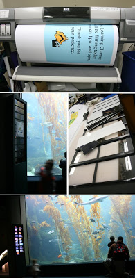
The Birch is often the venue for media events. We get notifications that this or that channel will be filming on a particular day. Today, TLC (The Learning Channel) videoed some TV show about a single mother on a date with a guy, who was to meet her kids for the first time. Anyways, the director wanted areas of the aquarium closed for their videoing, so Exhibits dept was to whip out a sign warning guests of the situation. I gave the Birch logo fish a little director's clapper.

Knowing there would be videoing in the Hall of Fishes, I figured I'd better get on with fixing the kelp tank fish ID label box, which at the time sat unlit and blank. Fish labels are slid into slots on the back of the plexi window. The problem was, the plastic separators that formed the slots (black horizontal stripes on pic 3) kept unsticking and falling off, and thus all the fish labels would fall too.

So I took down the entire plexi sheet and epoxied the previously double-stick taped plastic separators onto the plexi. After a few hours of trouble shooting (fish labels that were too big to fit in standard slots, epoxy reacting with vinyl, etc) the whole thing was remounted and will hopefully stay in tact for at least a year, at which point we will be getting digital labels.

A surprising amount of exhibits work is simply maintenance of signage that is already up. Stuff is CONSTANTLY falling down or being broken or chipped or peeled (intentionally, by kids that don't know better as well as adults who can't resist a picking at sticker edges).

GOPINK, a team of women raising money for breast cancer research, hosted a fund-raising fashion show and silent auction. This was my first direct sun fashion show shoot, and I made use of flash to reduce harsh shadows, though some shadow still came through, particularly in the eye socket area.

I've photographed so many fashion shows now, that I have certain expectations of models. With experienced models, there's some unsaid agreement that at the end of the catwalk, she will strike a photogenic pose in each photographer's direction, and seemingly, wait for a click, or a nod, to confirm that a good shot has been taken. I know that she will strike at least 3 poses showing off different angles, and hold each one long enough to get 3 or so shots. With all these expectations, I'm extra appreciative of models that know what they're doing, and inwardly exclaim to newbie models: Walk slower! Stop and pose! Look this way! Argh! I never expected to become particular about catwalk models.


Happy Birthday to my blog! I've blogged for a full year.

I've been trying to pull out another screen printing idea. My brain is so cluttered with other stuff at the moment, that it is hard to think creatively. I kept thinking of cliche designs, like swimming koi. While I am fond of koi, I also like the style in which koi are composed and presented. Think full back Japanese tattoos. Fish, gracefully posed, complemented by stylized splashes of water, undulating lines indicating water movement, a sprinkle of flower blossoms... But, so uncreative to feature koi! It's been done a million times.

One of my unofficial screen printing goals is to include local animals in a design. I've not personally experienced that many local animals in the wild, but of the few that I have include leopard sharks, guitar fish and round rays, whose mating territory I invaded when I snorkeled amongst them a few summers ago. OK so I didn't really see a sea urchin, but I do know some sea urchins are sand dwellers, as I have drawn them for Birch classes that have to do with sandy lifestyles.

The stylized waves are far too curly, harkening back to an old European decorative aesthetic as opposed to an Asian one, so I will change that. But you get the idea.


I brought my camera in to work to photograph some tank windows for the Hall of Fishes renovation project. As always, the jellies mesmerized me and I turned my attention to them instead. Even in sports mode, they moved too quickly in the limited light to get crisp photos (at least on my camera). This one wasn't bad though, as it's more about movement than details. It looks like it is in the midst of a dance, but it also looks like a discarded tissue.


Island Divine is an annual fund raising event for the Junior League of San Diego, "An organization of women committed to promoting voluntarism". As I peruse my event program for a succinct translation of what that all means, I think this sums it up: "Women building better communities".

Some 20 restaurants and another 20 beverage companies (breweries, wineries and even Jamba Juice) served up unlimited refreshments to many nicely dressed charitable folk (many in splendidly colorful sun dresses) who huddled around heat lamps on this unusually winter-like day. The theme was the Island of Capri (Italy), and was situated at the Ellen Browning Scripps Park at La Jolla Cove.

Events like this are fun as I can partake in people, environment and food photography. Chefs accomodatingly set aside small displays of food for me to photograph. I'm not sure what the above item was, but it was set on a coaster for a more pleasing background than a paper plate. JRDN is known for their meat and seafood specialties, and although I didn't eat this item, I commend them for their sustainable seafood selection, and use of organically, local grown produce.


Day in my life at the Birch Aquarium Exhibits dept:
Five minutes after 8:00am arrival, notification from an aquarist that the fish labels for the kelp tank are falling out of their places in the light box. Grab roll of velcro tape and scissors to reassemble fish photos and descriptions inside light box before aquarium opens to public. Meanwhile, watch aquarists scuba in the kelp tank, turning all the turban snails (saucepan size) back upright (a feisty female sheepfish had gone around and flipped them all over).
*morning tea/ coffee/scone break*
Finish applying laminate (big sheet of sticky stuff) to 4 signs printed the day before. Deliver to aquarist.
Suddenly remember that I'm to photograph a Education class for a brochure. Go to classrooms, photograph for 45 mins. Can't help but take a photo that includes one of my graphics (see above).
Laminating of giant squid poster goes badly, must reprint. Reprint squid on canvas.
*lunch - watch tireless kids and devious seagulls in the picnic area*
Get request to print out a poster for the weekend Family Day event. Must find old file from previous Family Day event, and update all the info in Illustrator. Print draft for approval. Approved. Load large format printer with heavy weight paper, deal with finicky printer, print poster.
*gossip about Wyland, who apparently drives a hummer (!) - he'll be visiting Birch this weekend*
Throw together quick pdf of Family Day schedule 1/4 of letter size to hand out to visitors.
Clean up scraps of foam core. Roll up mis-printed stuff to take home and make use of later.

On Sunday, I photographed Taste of the Nation, a fund raiser event to end childhood hunger in the USA. Some 20 or so restaurants were represented atop the Solamar Hotel, each with a little table, whipping up bite sized specialties. Tickets were around $100 per person (another photographer perk... I get in free of course), and food and drinks flowed non-stop.

The highlight was an Iron Chef competition, in which 3 pro chefs were aided by a kid sous chef. The youngest was 8, and the oldest, 14, I think. The secret ingredient... English Peas. What makes them different from other peas? I don't know. Note that the kid chef uniforms were also pea green. Coincidence? Are they drinking champagne or sparkling cider? Hmm. The girls came from a new local school program in which kids grow their own veggies in a garden patch, and then cook them to eat. What a great idea.

I noticed other photographers had brought their flashes along. The sun was very bright, which meant harsh shadows on faces; thus a flash would've been a good idea - a "fill flash" would've softened the shadows without sacrificing depth of color. I lightened my photos quite a bit so that the shadows wouldn't be too dark, and the pics may have turned out a little over exposed. Well, I'm still learning on the job.


The theme of recent posts: tentacles! Here is a dissected squid, with certain squid guts highlighted in color. This poster-sized image is used to teach kids about squid guts in the aquarium class rooms. I based this on a previous diagram that we at Exhibits deemed too ugly to reprint - it was as if someone had hurriedly traced an illustration out of a book with a marker and then enlarged it. So I redrew the whole thing freehand in pencil, then filled with pen and ink, scanned, vectorized, cleaned up, colored.

I added "freehand" because I am always asked if I draw "freehand". It's a bit insulting - though maybe I should see it as a compliment? There are very few instances in which I will trace: if I have to make duplicate (in which case, the first one is freehand), and if I want photographic accuracy for really precise scientific illustration. Even then, I only trace outlines from photos that I've taken. I certainly don't trace other people's images.