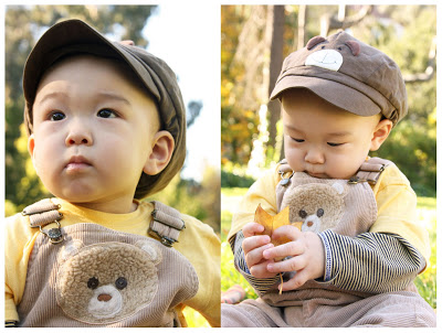
My first Bay Area baby photo session. Actually, 11 month old Jayden was more toddler-like than baby. Older babies are harder to photograph; they're much more wiggly and mobile. This leaf engaged him for a good few minutes, so he sat still enough for photos. He was also distracted enough not to remove his hat.

We found a patch of shade in a grassy area of UC Berkeley campus. A more ideal background would not have been as strongly lit; a consistently medium colored background would have better set off Jayden in the foreground. But the photos turned out fine anyways.

I was a red carpet photographer for 2 nights. Eight hours worth of wooing shoppers to stand in front of the pink "repeat logo" banner, under hot lights, a half minute of fame as I played paparazzi.

It was a shopping event for ladies, called "Girl's Night Out". I applied for the event photographer position, thinking I'd be photographing actual shopping, but I was stationed here instead. Which is actually an easier, though less creative/ exciting job, than roaming the stalls and capturing candids. I wound up taking about 400 red carpet shots, which will be posted on the shopping site so that ladies can download their pic, for free.

This job required a lot of interaction, but also allowed for a lot of people observation. Interesting to see that some women are very enthused to be photographed and run towards the red carpet dragging their friends without my even asking, while others take one look at the red carpet/ banner, are repelled, and walk away, as quickly as possible.

When I applied for the job, I pointed out that women at a shopping event are likely to feel more comfortable with a female photographer. I'd guess it's particularly true when it comes to posing at the paparazzi station. There was much verbal expression of self consciousness, when ladies were prepping for the photo, or deciding whether to be photographed or not. "Not in these clothes!", "I need more make up!", "I look terrible in photographs" and "this is my better side" were common comments. I do think it would have been more intimidating with a male photographer.


At my last craft fair, I included a sign that said that I could make custom pendants. Many shoppers thought this was a great idea, and took my contact info. One of them actually contacted me to place an order.

Here we have (front and back) Lotus and Cherry Blossom, Geisha and Panda, and Dog with ears up and Dog with Peter Pan hat.

Engagement photos are always fun, especially with enthusiastic couples. These two fell easily in comfortable poses. I was in NYC for the weekend, and so we took advantage of the hints of autumn in the leaves. The turquoise came out beautifully - I may recommend models wear rich colors in the future. We were also fortunate to have a light clouds, providing the ideal filtered light.

Kusumita Fashion Shoot, take 2! This time we had a stylist (Kusumita owner and designer and model, Camille), and life was much easier.

We recruited new models, including Jessica, to the left. She fell naturally into varied aesthetic poses, and was a breeze to work with. For me it was more a matter of scooching around to get the best angles, and less worrying about where the model should place limbs or incorporate twists.

Having 2 models worked well: I'd photograph one, and in the meantime, Camille styled the 2nd one, so that she was ready to go as soon as the 1st model was photographed. Seamless.


A historic, exciting day! I couldn't sit still and wait for results to get in, so it was either continuous snacking or photo editing, to pass time.

Today I headed to the Botanical Gardens in the Golden Gate Park to photograph some Kusumita fashions as modeled by designer Camille. My first real foray into fashion photography - cat walks and models that already know how to pose don't count. I finally understood the duties of the stylist - it's enough to think about, composition and lighting, but to incorporate poses, showing off clothing, worrying about hair and jewelry, wind direction (does the skirt poof out unflatteringly?) - it was definitely a challenge. Fortunately Camille had studied some poses out of the latest Vogue. I should do the same, though these days my magazines are more likely to feature photographs of vegetarian food.

Anyways. I called upon my figure drawing coordinator experience from years ago - with inexperienced figure drawing models, I had to pose them interestingly. One bit of advice to achieve this make sure that the 3 planes: face, torso and hips, do not all face the same direction. That makes for a boring pose. At least one twist, at the waist and/or head, makes for visual interest. Straight limbs are also boring; bend them.

This white dress called for non-color photos, even before I photographed it. So did the tree in the right hand photo. Monterey Pine, I believe - had great texture, a contrast to the softness of the dress. The late afternoon light was also difficult to photograph with. Strong shadows, so I used some flash, to lessen the contrast. The bench shot, below, was in the shade.


The yellow cast on the pumpkin kid was really bothering me, so I typed "How to correct white balance on photoshop" in google, and found a page that told me exactly that. I use levels on most of my photos, but it didn't occur to me to experiment with levels of Red, Green and Blue separately, as opposed to RGB all together. I'll have to think about how to explain what is going on qualitatively, but for now it works as a tool to correct white balance.

Getting the right white balance basically means that what's white in real life should be white in the photo. Often, for instance in shade, white turns blue-ish, and everything else is blue-ish too. Digital cameras do their best to fix this, but sometimes they misjudge. That's why there's the options on a camera to choose shooting in Shade, or in Sunlight (as represented by little icons), so the camera is given a hint as to what white balance to expect. Anyways, white balance corrected is on the left.

P.S. Yes it's about TIME I personalized my blog header, instead of using a blogspot-provided one.


My new Canon 50mm f/1.4 lens arrived 10 minutes before I left for the JCCCNC (Japanese Cultural and Community Center of Northern California) Halloween Carnival in Japantown. I put it on my camera while on the bus, and tried photographing some bus riders. So far so good. Would it be up to the low light challenge of the JCCCNC gym?

I was impressed. As long as kids weren't moving too fast, this lens did a great job. Background blur was fantastic - really makes the foreground subject pop. My white-balance was a bit off, resulting in the yellow-ish hue. I really liked photographing kids without assaulting them with a bright flash. The biggest challenge was the fixed focal distance, which as long as there was ample space to backup, wasn't a problem. When examined closely, some of the pics are not as crisp as I'd like (due to not quite enough light for a fast enough shutter speed), but for these purposes, they're sharp enough.


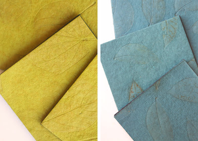
Product photography is a whole different world. There's the matter of posing the items. What background? Most products look best on a plain, white background - at least, that's the popular style on shopping websites right now. These are sets of coasters made of paper fibers, with leaves embossed on the surface. So there's a need to capture the delicate detail. Fortunately, there's room for more than one pic on the website these are headed to, so I could get close-ups like these. There's also the issue of being consistent, which I was not. Note that though the coasters are overlapped similarly, the shadow falls on different sides of each the green and blue coasters. I used natural light; posed the coasters in the shade, but near to an open door.


The Lion and the Witch, minus the Wardrobe, yelled their heads off for these photos. It started with the Lion providing me a sample roar. She counted down from 3...2...1... ARRRRRRR and her twin inevitably joined in, ARRRRRRR.

It was nice that they were standing a little out of the way of the crowds, in terms of background. They weren't in a hurry to do any activities and the ARRRRs lasted a long time, which gave me a chance to take a lot of photos. These are my favorites.

The bumble bee had just won a plastic witch finger, as a result of successful ring toss. I volunteered to photograph the Randall Museum halloween event. The Randall Museum is a small children's museum, like a discovery center in the arts and sciences. It's located on top of a hill, with an unbeatable view of San Francisco. I was asked specifically to photograph kids engaged in activity, and for the activity to be obvious if say the photo were printed very small. This pic isn't the best example of such a photo, but I wanted to post it on my blog anyways.

Of course I took the opportunity to check out the museum as well, to see if it were a place that I might want to try to work, and it is! It's much less "object based" than museums I have experienced; from what I could tell; much more emphasis on activities. A lot of the space was dedicated to classrooms and workshop rooms like a ceramics studio and wood shop.

I brought my camera to the dog park. It was rather early in the day but I figured this way, it would be easier to match owners to dogs, and thus easier to ask permission to take photos. I'd seen Gracie on previous trips - not sure what breed she is, but her owner commented on how difficult it is to take photos of an all black dog. So of course, I took that as my challenge for the afternoon. Lucky for me, Gracie sat and stood still quite often, and wasn't put off by the camera.

I'm still trying to figure out what makes for good dog poses/ compositions. I try to apply compositions that I use for humans to dogs - e.g. very close cropped, but I'm not sure that works.


At Sassy Chicks, I met a jewelry designer. She gave me her jewelry business card. After talking to her for a while, I learned that she is also a belly dancer, and she gave me her belly dancing business card.

Such is the life of a freelancer! I need several business cards. Here's one for illustrations and art of the natural science genre, a card geared towards the museum world. I went with a postcard instead of biz card for photography because I could fit more pics on it, but I'm starting to think I ought to have a new photography biz card made too. Then there's event photography, which is a different skill and produces photos of a different feel from portraits. And finally, I really ought to have a craft/ wearables card.

Biz cards get printed in bulk, which means if I have 3 or 4 biz cards, I will have piles and piles of cards...


I decided I needed to work on some self-marketing. Relying on word of mouth can go so far. And right now all I have to remind people of me are a set of home-printed business cards with a black and white photo of dancers, advertising my photography.

Specifically, I'm interested in photographing people in a casual setting. Portraits, but not fancy, uncomfortable portraits. I like to catch moments when people are feeling relaxed and behaving naturally. I picked out some photos from my portfolio that I thought embodied those kinds of feelings. It turned out that the photos I chose already had a color scheme.

Next I had to fit as many examples of my photos on a postcard sized page without making it seem overcrowded. It's a little bottom heavy, but I think I can deal with that. I wanted to include the bottom left image as it's a candid family scene, even though it's more detaily than the other pics. I used a handwriting-like font for the text; friendly looking, yet clean. Admittedly I made this in a bit of a hurry because I found a postcard printing site that was having a sale, and there was no telling when the sale would end. Basically I'll be getting 500 postcards for the non-sale price of 100 postcards.

I checked for typos at least five times. I don't want to know if you see any.

Actually, after observing the postcard in my yet to be posted blog entry, I went back and made a few changes - got rid of some of the dark area to the left of the big baby face, photoshopped out the man in the background of lobsterboy, made the whole left column a bit wider...


Part of the fun of craft fairs is meeting other artists and potential friends and collaborators. I met the owner and designer of Kusumita (www.kusumita.com), also new to vendoring. I've always wanted to venture into fashion photography and advertising, so I offered my photographic and graphic design services.

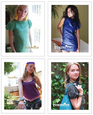
Camille already had some photos of models sporting her designs, so I used those images, in which the models were very creatively posed. I did some lightening and brightening, and strategic cropping to better highlight the colors and shapes of the clothing, and cut out some of the distracting background. She also wanted a new photo to include her white t-shirt, so I took the white t-shirt photos. On all the images, I placed the Kusumita logo, a la magazine ad.


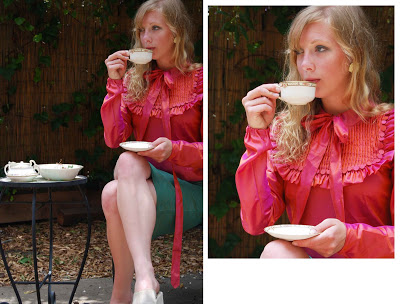
Below is an example of the visual wonders cropping an image can do. To the left, the original image. While the pink blouse does stand out on it's own, the paleness of the ceramic ware on the table, and the legs, create a strong distraction from the blouse - the real topic of interest. The little table is set entirely apart from the woman, and almost cuts the composition into quarters: the top left being background, top right: woman and pink blouse, bottom right: legs and bottom left: ceramic ware and table. the four sections don't quite pull together.

The cropped image gives all attention to the woman and the blouse, and the teacup and saucer she holds is enough to give the suggestion of teatime with out the rest of the ceramics.


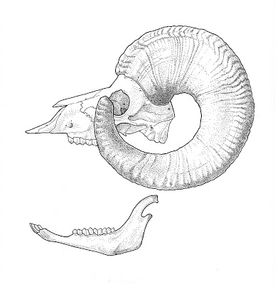
It's been a long break since I did any mammal skulls, but I'm back. This bighorn was 80% done when I last left it - I must have gotten tired, filling in the horn detail. As the skull is back in San Diego, I had to work from some photos I'd taken of that skull, to finish the drawing. Next, I need to work on the side view, though I never did find out conclusively what to do about the large curving horns that block out a good portion of the face. As these drawings are for a guidebook, I figure one can be pretty sure when they've found a male bighorn skull, and don't have to look for details in the skull drawing to match to the specimen. Thus some facial blockage in the drawing won't be a big deal.

Bighorn skulls are really heavy by the way. Those sheep must have some massive neck muscles.


Indie-Mart started at 12 noon, but things didn't really get rolling until 2:30pm. I was getting worried about simply coming out even after booth rental. But the afternoon crowds showed up, and despite our lovely location in front of the port-a-potties, sales went decently well. The live bands and DJs played on the other side of the port-a-potties, so actually it wasn't a bad place to be; the music audience traffic caused shoppers to slow down near to my booth.

The cuff bracelets you see in the foreground were my most popular item, followed by the pen & ink decoupage pendants, though not one animal emerged as the most popular. I had leftover t-shirts too. T-shirts, I've decided, are not worth the effort and cost. I'll do them for friends and via special order, but to have to guess what sizes in what colors with what design shoppers will want to buy - it never works out for me.


On the side of the booth, I also set up my comics, and a little display with my photos, in case anyone happened to want their portrait taken. Only one person took a card. I think had the demographic been more parent-oriented, photography might have been more popular. This crowd were 20-30 indie types, only a few kids, but lots of dogs! Speaking of photos, these were taken with my little powershot, as I didn't feel like lugging the dslr around. Consequently, not so pleased with photo quality, oh well.

Someone spilled gin on my cuffs, towards the end of the day. She started trying to flag me down, and I thought she wanted to Buy a cuff but no, I was notified that my cuffs sat in a puddle of gin. She apologized profusely, and fortunately the cuffs were in a plastic tray, so the gin hadn't spread to other items. Well, better gin than a more stinky drink. So cuffs were taken off display to be blotted.


I've added some more animals to the collection. I'm fond of the rabbit/ tortoise pink pendant, as well as the latest design: hedgehog. With hedgehog, I decided to add some color to the drawing, with red ink and brown color pencil, and the result looked great! Why didn't I color in any of my drawings before??

Today I've been working on my displays. I've crafted a 2D cardboard tree on which to hang jewelry (held in place by a wooden clothespin, most likely). After cutting out the tree silhouettes from re-used cardboard, I decoupaged them with some wrapping paper. The paper is dark brown with light slate-blue fuzzy stuff making up the pattern. Pretty cool. Then the challenge was figuring out hot to get the trees to stand up. At first I thought of using 2 simple bookends, back to back, and attaching the tree to that. But I couldn't find bookends. I rummaged around and found a wooden sushi display/platform and a small piece of wood I'd bought many years ago in Tokyo - back in my wood block printing days -that I'd never used. I glue-gunned the wood block to the sushi platform, tied the tree to block, and voila. The ribbon looks a bit awkward, I'll try to find some other way of non-permanent attachment.


Quail and Plover have been my two most popular Avian Life series pendants. Perhaps it's their shape as well as subject; they are smaller than Hummingbird and Barn Owl. Perhaps it's the dual colors; on the backs are Quail chicks and Flying Plover respectively, on different fabric. So consequently, I don't have many of those left in stock, and made a new batch. These are waiting for their varnish to dry out.