This has been my busiest week since I arrived in San Francisco. I definitely overbooked myself - 5 weekend shoots, plus 3 weekday shoots. It would've been handle-able, except I had to take on the Insect class teaching duties of a sick teacher. As a result, I am constantly on the go. In some ways I thrive on being busy and productive - in others, I long to sleep in.

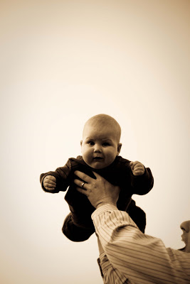
A 7 month old, chubby cheeked boy who smiled at the sight and sound of squeeky toys. Another flying baby yes... it seems that babies enjoy the weightless sensation. Held against a late afternoon clear sky, it's almost as if we had a white backdrop, but the subtle vignetting gives the background depth. I unintentionally cut most of the face off of the dad, but I rather like the result - one can imagine the rest of the facial expression, and plus this way, the focus is entirely on the baby.




I bought a reflector! It's a portable fabric circle, which stretches out and collapses like a half a car windshield shade. It has a cover, 2 circular sheets sewn together like a pillowcase, with a zip at the opening. There are 4 sides to it: white, gold, silver and black, different reflective (and one absorptive) surface for different purposes. I used white in this case.

I knew I needed a reflector, as I was going to taken an outdoor afternoon photo to in front of the golden gate bridge. He's holding the reflector to the right, reflecting sun light into his face; you can see how his chin is lit up, but not so much as to take away the form of the face. The reflected light is creating what's called a "fill light" - ie, filling in the shadows. Otherwise, the shadows would be very harsh, and features obscured. It looks more natural than a flash, but a flash could also work as a fill light. Yes, it was a beautiful day in San Francisco!

Today was my last session with Kathy Mata Ballet. We filled in the gaps of what photos were still needed for the Kathy Mata book, which included the cover as well as some head shots. The concept for the cover was an image of Kathy actively teaching; ie, perfecting the positioning of a dancer. Yet, it had to be Kathy who was the focus of the photo, not the dancer. A dancer was enlisted hold a position, while Kathy pretended to fuss over her, both trying not to look like the whole thing was staged. This one looks staged because the dancer is smiling - dancers don't usually smile during grueling rehearsals.

Also imperfect for the cover; we wanted Kathy's 3/4 view, not so much the profile. Also, both Kathy and the dancer have equal weight in terms of the subject of the photo. But, I like this photo anyways.

It is so much easier to photograph when dancers are holding positions with the intension of being photographed! I guess that is obvious. Anyways, I shall miss my weekly visits to the ballet studio.

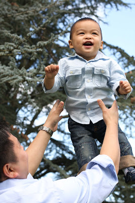
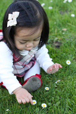
I did two photo sessions with one year olds at the Botanical Gardens today, one in the morning, and one in the afternoon. Both one year olds had recently started to walk, which meant I did a lot of running around, trying to keep ahead of them as them tumbled forwards. Both pairs of parents put in an impressive effort to make their baby smile. The guarantee method to make the boy smile was to toss him - I'm surprised I managed to catch him in mid air. The girl occupied herself with the picking of flowers, of which there was an endless supply. She had great dexterity for someone so little.

I preferred morning light to afternoon. The light even at 11am, was softer than light at 3pm. Afternoon light made the shadows in shade pictures particularly blue. I'm still working on ridding of that cool hue.


The original plan was to do an outdoor portrait session. Alas, we were rained out too many times. They invited me to their house for a photo shoot, and presented me with three different lighting situations: the living room, the study and the guest bedroom. The former two (below) provided the least light, and the room decors were of a dark palette. All photos were taken by my trusty 50mm f/1.4 lens. A tripod might have helped, as I deleted some photos due to camera shake (ie, me not holding the camera steady for the duration of the shutter - the shutter is open for a relatively long time in dim light).

I was brought to the guest room third - saved the best for last! East and South facing windows, covered in gauzy white fabric instead of with wooden shutters. Made a world of a difference for natural lighting... not to mention the light pink walls to reflect some warmth onto my subject. An interesting informal comparison study on the effect of room interiors/layout on natural indoor lighting.

I'm still plowing through the ballet performance photos, with the help of Lightroom. I have the demo version, but I've decided to purchase it, as it's proved to make workflow with hundreds of photos SO much easier than using Photoshop.
The performance was in the, hmm, atrium? of a fancy retirement home. The backdrop is an indoor area with plants, lamp posts and a fountain. Very cluttered.... not ideal for dance photos. Also, low light - unideal for taking photos of moving subjects.

One of the dancers lent me his Canon 5D, the next step up from my own model. I previously relied on automatic focus, but he recommended a different technique; telling the camera in advance where I wanted the focus to be, so it didn't have to spend time searching for subjects to focus on (which is slower and less accurate). So... I had to predict where the dancing action was going to take place, focus there, and then take the photo when the dancer moved into that spot. That, plus ISO 1600 (grainier, but better at capturing motion), on aperture priority f/2.8 or so (good for low light situations), seemed to do the trick! Oh, and there's the improved camera body too.


I photographed the dance performance today, at the retirement home. One of the dancers lent me his Canon 5D, and gave me some tips on camera settings/ technique for taking action shots in low light. I'll describe those tips later, as now I'm exhausted from seemingly constant wielding of camera entire weekend. And certainly I'll post some dance photos.

After the show, the dancers mingled with the retirement home residents. I'd been asked to document this interaction. I don't know what they were laughing about, but these two seemed to have found a connection.


"Tol" is the Korean First Birthday celebration. I photographed an abbreviated, informal version of Tol. Baby was dressed in Tol-Bok, the Korean traditional Tol outfit, and before him were placed various items. This activity is called Toljabee. The baby chooses an item which is an indication of the baby's future.

Here, we see our birthday boy reaching for a stack of money, wrapped in green ribbon. Hooray, he chooses wealth! Next he chose the Ruler, which means he will have talent with the hands. Next went yarn - Long Life. Book - good scholar was next, and he completely ignored Mouse - representative of Computer Programmer; his father's profession. The very first things he chose were actually his shoes. He pulled them off his feet and inspected them. "Cobbler!" someone called, and someone else exclaimed "Fashion designer!"

It was a good event coverage session for me, with many babies to photograph, friendly people and good natural lighting coming in from the large windows. However now I have 500 photos to go through and edit.


It's been a while since I've done anything artsy, hence the MIA from the blog. I started teaching insect classes this week, and even though they're half hour sessions with 4 year olds, my brain is tired. But, it's back to working on the t-shirt. I've been trying out different fonts, and apparently it's been difficult for people to agree on a good font. The original font, Bauhaus, was deemed slightly difficult to read. I like Aardvark Cafe font also (2nd example above) but someone thought it was too fancy. I threw in Typewriter Keys font in at the end, because I've been looking for an excuse to use it and haven't found one yet.

The fonts provided with programs like Word etc are generally designed for text, not for posters or t-shirts. So I had to hunt some down. I've been using Urbanfonts.com, which has a lot of free fonts as well as buyable ones. But the interface is clean and user-friendly, not like other font sites that have flashing banner ads, or are merely organized by font name.

My font selection has been based on the feel of the illustration. The bee has volume, it has a hefty presence, it has a bold outline, lacks formality. It would feel awkward if the font was skinny, or if it were a serif type font (serif means a letter like "I" has the little lines on the top and bottom, like in this font your read now). Sans serif (ie, without serif) has a more modern look, which I think complements the bee. Anyways, I've just sent off another series of bee samples with different fonts to be critiqued.


There are moments when I spot a great candid shot from across the room, and hope that the people involved maintain that mood/behavior for the time that it takes for me to move, frame and focus. This ballet practice took place in The Sequoias, a retirement community at which there will eventually be a ballet performance. The lighting was terrible. From one direction came harsh yellow incandescent light and from above, cold, dim, rainy day light filtered through a skylight several floors above. Photos looked considerably better in black and white.

Costumes arrived yesterday, and towards the end of rehearsal, dancers put them on for a trial run. The costumes were ordered from a catalog, where one can choose styles and colors. In the mirror, they checked out the movement of the outfits while dancing, and determined that the little dress needed some tailoring, as it fit rather shapelessly around the torso.
This was a night photo session, in a room lit by overhead lights, and with paneled walls. It made a big difference; the other studio, with all white walls and white floor, was much brighter due to light reflection from these surfaces, even with the same overhead lighting. Consequently, I couldn't get as crisp photos as I'd have liked.


The latest version, with wing venation and some translucency to the wings. Moved and enlarged the text. Photoshop layers came in handy for wing coloration; the body and legs were colored brown/yellow (color layer 1), and then a new digital layer placed over that to color the wings in white-ish (color layer 2); made that entire layer 50% opacity so that the brown legs would show through. I wanted some of the white wing highlights to be completely opaque so I drew that in in yet another layer (color layer 3). Text has its own layer, as does the black outline, on top of all the color layers. Green background is the bottommost layer.

Below is the bee design placed on a sampler of wholesale t-shirt colors.


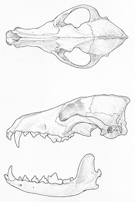
I'm designing a t-shirt design for a conservation non-profit I work for part-time: SaveNature.org. Their annual fundraising event is coming up, and each year they put out a new t-shirt that features an insect and a punny phrase. This year it's "bee inspired". It seemed that there was a preference for sticking with the scientific illustration lay out (ie, pinned insect, wings & legs splayed, symmetrical) Given the last minute deadline, I went with that rather than to draft out possible bee-in-flight compositions. But, I did want this to have a more graphic edge, unlike my dry stippled mammal skull drawings.

I photographed bumblebee specimens, penciled out a draft, traced that on to bristol board (heavy paper) and inked it in with brush and ink. Brush has great personality. The width of line can be varied, and I believe that added an artsy touch that makes the bee feel hand created, a bit like comic drawings. Bumblebees are very fuzzy, so of course I put the brush to work on the fuzz. The black ink gives a deep plushness - Speedball Super Black India Ink is the best. The color was added in photoshop, and I used brown under the black of the thorax and abdomen to give the bee further volume. Have yet to draw out the venation on the wings.

When ever there's a free t-shirt commemorating an event, it's most likely white. These days, organizations are getting better at providing t-shirts in sizes other than L and XL. But in my life, I've accumulated too many over-sized free white t-shirts in my life, and so I dislike white t-shirts. I would love to have this printed on a green t-shirt. (Hmm yes, that green is a similar shade to my wedding dress.) We'll see if I can influence the powers that be.

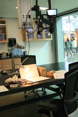
The Project Lab, at the Cal Academy of Sciences. It's behind the rain forest sphere. Here's my workspace, with a fancy camera hovering overhead. I can watch the live video on the tiny screen above, and museum visitors can watch on the large screen outside the windows.

It's vacation week for schools around here, so CAS has been packed and I've gotten a lot of spectators. I hear kids loudly asking: What's That Lady Doing?
And parents respond: Look She's Drawing! I'm never sure whether to look and wave. It looks like the room could be soundproof; those on the other side of the glass probably don't realize we can hear them. "Mommy are they Doctors?" Well, we do wear lab coats while in the Project Lab.

Today the first behind-the-scenes tour group EVER came through the PL. They were all from Netflix, about 20 grownups, several with cameras. One of them asked me about my background, and I said an MS and MFA, but the funny thing is I never learned any scientific illustration in either of those programs.


I am getting better at ballet photography. Having seem the routines a couple of times now, I can recognize moves/ positions, and know that they're coming up so I'm ready to photograph them. But, these photos are not of ballet dancers. These are jazz dancers, also practicing in the same dance building. The ballet book is to feature friends of Kathy Mata Ballet too.

The colors were definitely fun to work with; they really stood out against the all white room. The woman in the middle of the top pic is the teacher (leader?) I actually don't know much about them; I was brought quite suddenly into their practice studio and I just started clicking.

(Monday) Just found out: they are The Scratch 4 Bloomin, By Saki Suto.


The Cal Academy of Sciences hosted their first "Nightlife" event, on Darwin's 200th birthday. The museum was transformed into a club-y atmosphere, mostly via the DJ music played via loudspeakers throughout the space. One has to wonder what the live animals think of that. For 21 and up only, it was nice to visit the museum without the masses of children and strollers. I was event photographing, and everyone was in very good spirits, which made my job easy.

There was some special programming - a constellation show in the planetarium, a speaker (about Darwin, most likely), and each of the departments (Ornithology, Herpetology etc) had an interactive table where people can speak with researchers and look at specimens in the collection. All that, plus the music and drinks and lack of kids, were the differences from a day time visit. I think I've been going to CAS too much recently, and am starting to take it for granted... I want to see something different there. I'm going again tomorrow... 4th time this week.


The coyote skulls have arrived from San Diego Natural History Museum, ready for me to draw. They were sent to the Cal Academy on loan, as museum specimens can't just be sent to people's homes. When reading my CAS member newsletter a few months ago, I learned than an old colleague, then a postdoc, from my tech days at the National Zoo in 2001, is now a part of the Mammal/Birds curatorial staff! It was nice to have a contact, as it made the skull loan very easy.

CAS collections staff are actually very welcoming of artists. I was told of a number of other art projects involving specimens, and was given a tour of various places that artists could work, in the non-public areas. Today I was set up in the prep room, to photograph my skulls. Prepping what? you might wonder. Prepping specimens. Apparently, Ornithology was in the midst of defrosting their freezer, and thus the freezer's contents were arrayed over the large central work table. Having my camera handy already, it was hard to resist taking photos.

If you've been to CAS, you may have noticed the display lab on the main floor, somewhat behind the rain forest hemisphere along the back wall. This is where they put scientists on display so the public can ogle Science In Action via large glass walls. This is also where they place artists. There's even one work station with a video camera, that transmits a live feed of eagle-eye zoomed in action to a screen in the public area. This is where they will put me, so people can watch my tedious stippling and observe my hangnails.

Lightroom can do all sorts of artsy effect to photos, like this "Antique Light" effect. Reminds me of those photos of kids dressed in old fashioned outfits (paper boy, girls with ringlets holding baskets of flowers) where the boy is handing the girl a rose and the whole thing is in faded colors except for the rose, which is richly red. I even added a white vignette, as if the photo is fading from the corners in.

I have a trial version of Adobe Photshop Lightroom; it's downloadable from the Adobe site, and I can use it for 30 days. Of course the point of that offer is to hook me on and get me to buy it eventually. I think it might work. I've watched a few video tutorials, but I prefer to take the plunge and work out the functions by trial and error as the need arises. White Lightroom does the same stuff Photoshop can do, it's designed to handle huge workflow, like 100s, or 1000s of photos. Give that I can take up to 400 pics an hour, this Lightroom feature is really appealing.

I am onboard the Kathy Mata Ballet book project! It's been a long time since I've partaken in an artistic collaboration, and I've never had my photographs published in book form. KMB is a group of amateur adult dancers that volunteer-perform for retirement homes and raise money for brain tumor research, amongst other things. KMB has grown to a point where they're ready to take on a greater presence in the SF dance world. The gentleman to the left is a graphic designer, spearheading the project. He found me on Craigslist. I'll be attending several rehearsals and one performance. It's an intense project, all the photos to be taken by the second week of March, so the book can be self-published (on Blurb.com) and ready to sell at a big performance in late spring.

I'm really glad that she wore red today, good for striking photos. White-ish, as you can see, fades into the background but red really pops, especially with a little Lightoom enhancement.


Lessons learned from the SF Lunar New Year Parade: 1. Don't choose a viewing spot just beyond the judges tent. 2. Don't choose a viewing spot near the end of the parade. The final block of the parade was just past the judging tent and was packed with a crowd 6-8 people deep, yet many of the parade performers took off their costumes/ stopped dancing/ ran out of tossable freebies/ looked exhausted/ walked really fast because the end was drawing near.

Some 500 of us craned our necks to see the performers give it their all in front of the judges, only to be disappointed to find their effort level was much decreased for us. I do applaud the Golden Dragon runners, who in their meandering path must have covered 5 times as much distance as performers that walked in a straight line down the streets.

I didn't exercise my media connection in photographing this event, though in hindsight I wish I had; I could've asked where the best viewing spots were, and perhaps gotten a media pass to not be bound to the sidewalk like everyone else. I'd assumed that everyone everywhere would have a great view and show, so I needn't go to the trouble. Oh well. I did my best, and realized that I was out of photographing-with-flash-at-night shape (it's been... almost 3/4 of a year since I had to do a flash heavy shoot?), and was quite unsatisfied with my photos in the end.

And, I sat on gum on the curb. And, don't EVER eat at The Pot Sticker in Chinatown. It's terrible. Even their pot stickers weren't very good. I should have noted that there were no Chinese people dining in there, and that there were only forks and plates; no chopsticks, nor bowls on plates. Just one of those nights.